Tradeverifyd

Project Details
About the Project
Tradeverifyd operates in the global supply chain risk assessment industry. Supply chains are overwhelmed with bureaucratic, legal, humanitarian, and other governing variables which require extreme knowledge of the industry, and creative planning and problem solving to navigate. Tradeverifyd collects and analyzes information encompassing all of these variables to provide a risk assessment/solution service. Clients are only concerned with the high priority explanatory and actionable foreground activity, while Tradeverifyd manages and plans complex background processes therein.
Scope & Role
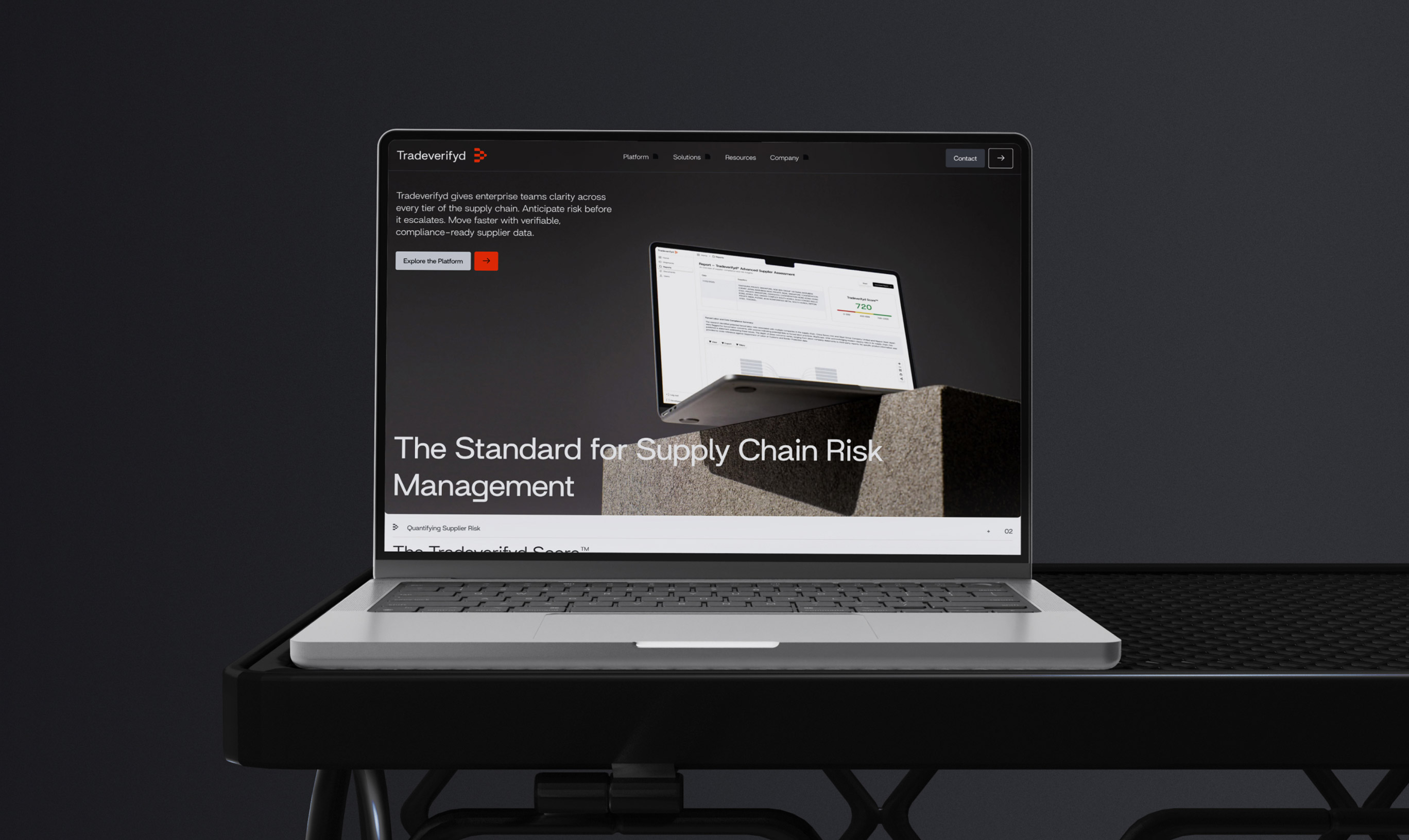
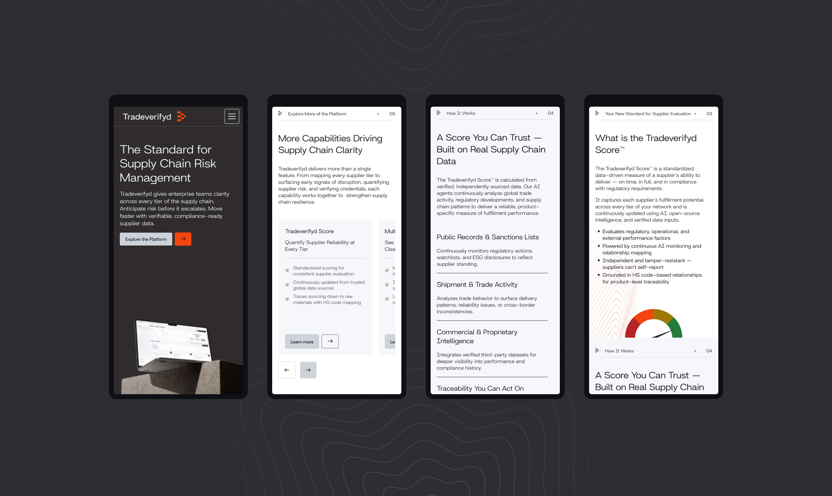
Tradeverifyd approached Wunderdogs for strategy, messaging, visual identity, and web design. My role was to design and deliver a visual identity system, design and write the brand book, and work alongside a couple other designers on the website.
Concept & Execution
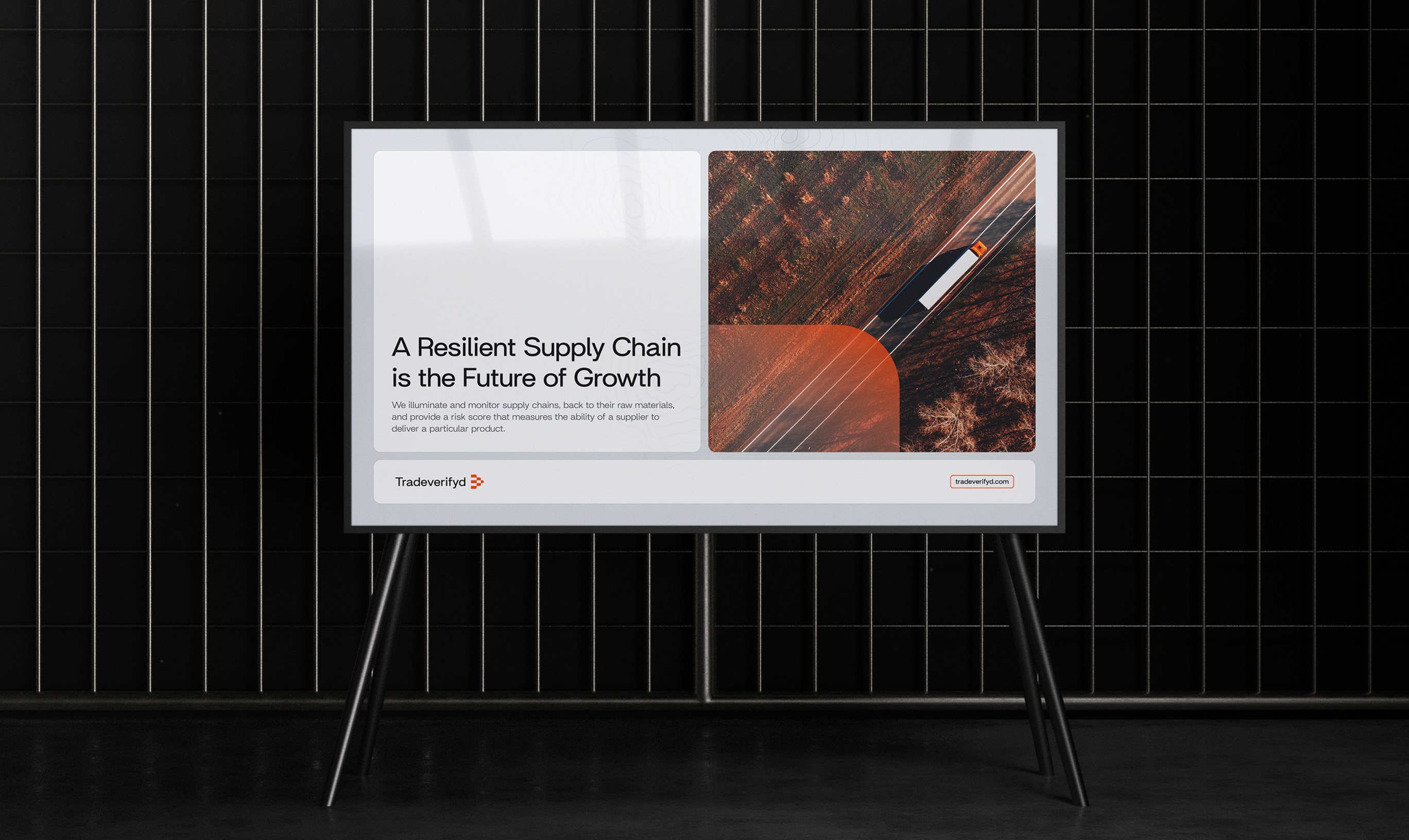
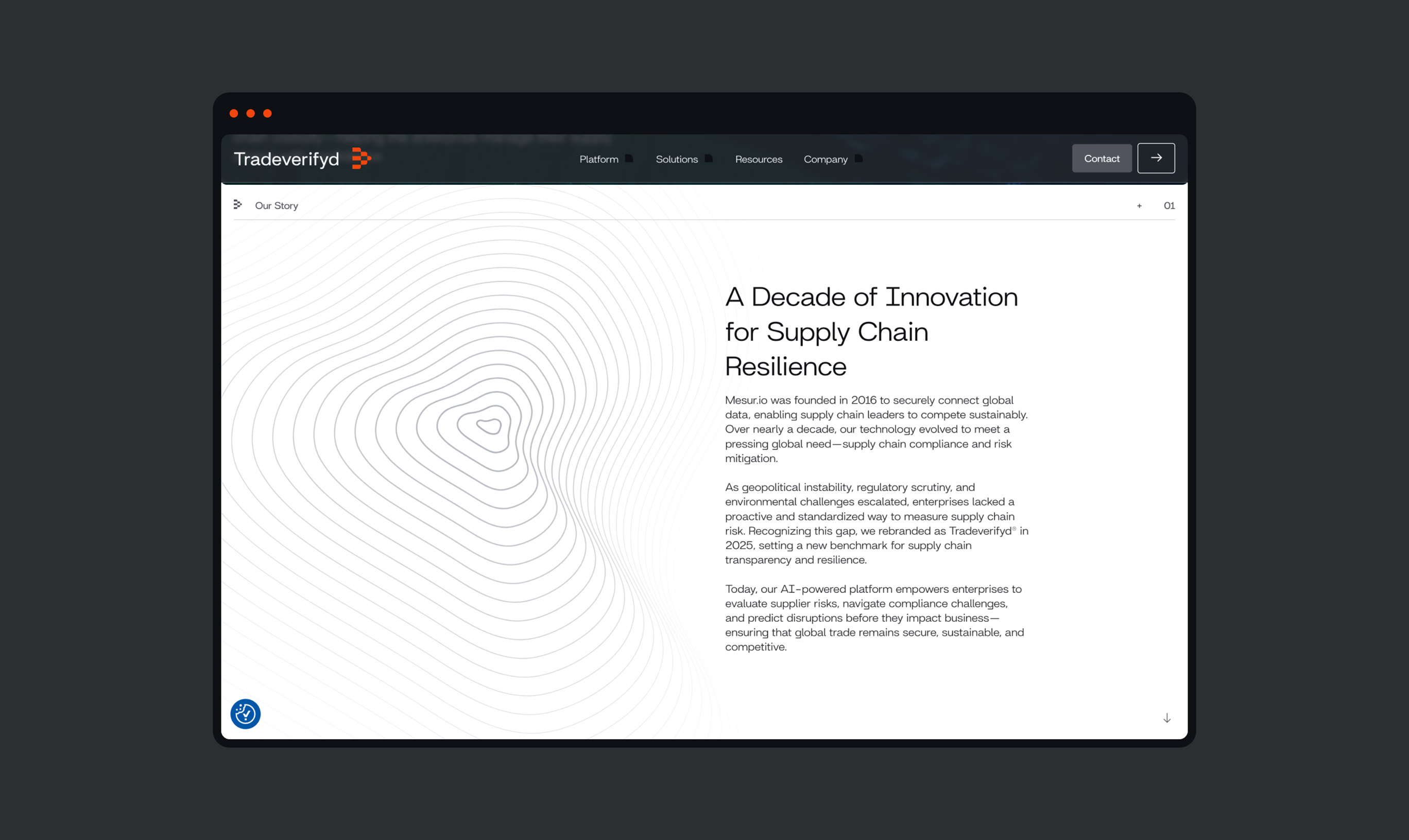
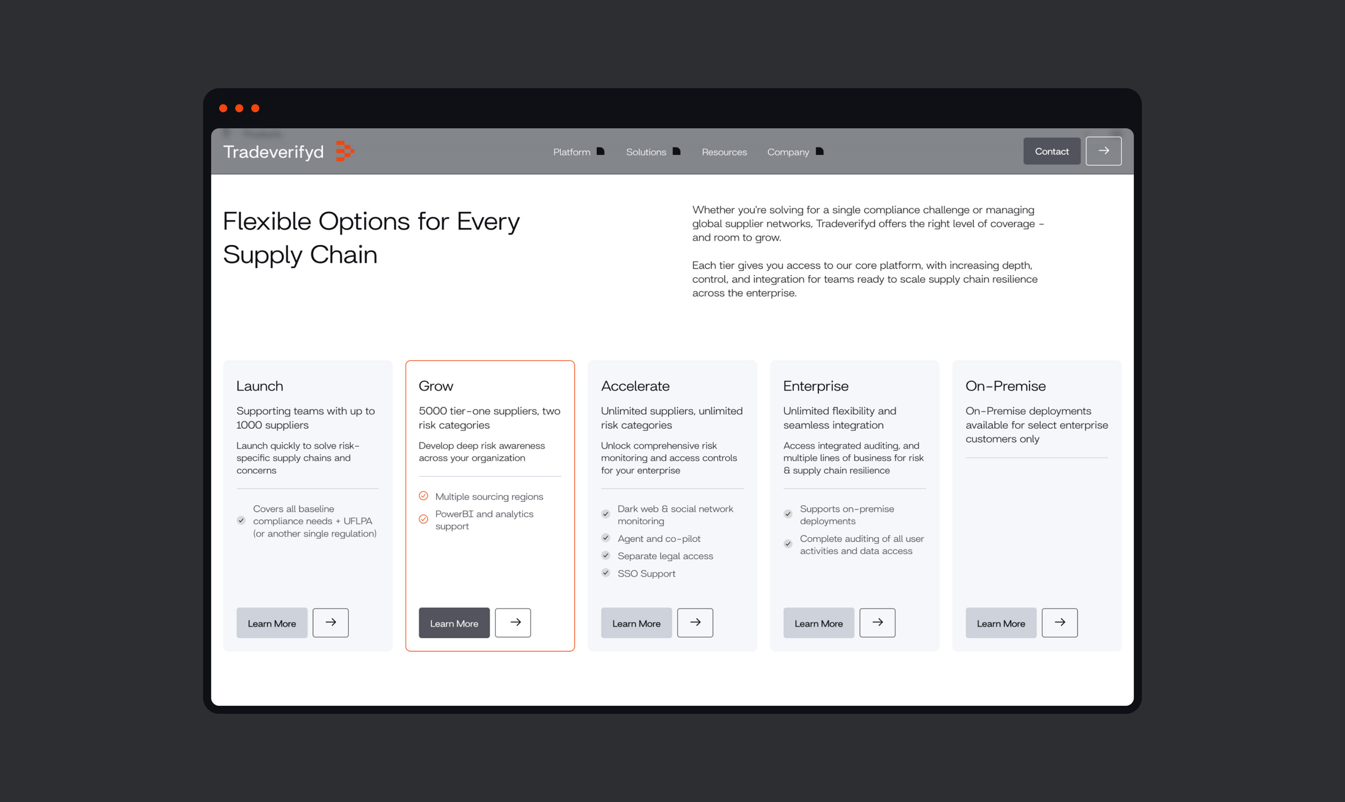
The visual identity is informed by the cumulation of a left to right waterfall flow, high priority foreground activity vs. low priority background activity (from the client perspective), and navigating terrain. A treatment for boxed containers helps emphasize this foreground/background concept, a fogged glass style is given to containers to partially reveal that there exists information in the background, but it’s not of crucial concern when taking in the foreground information.
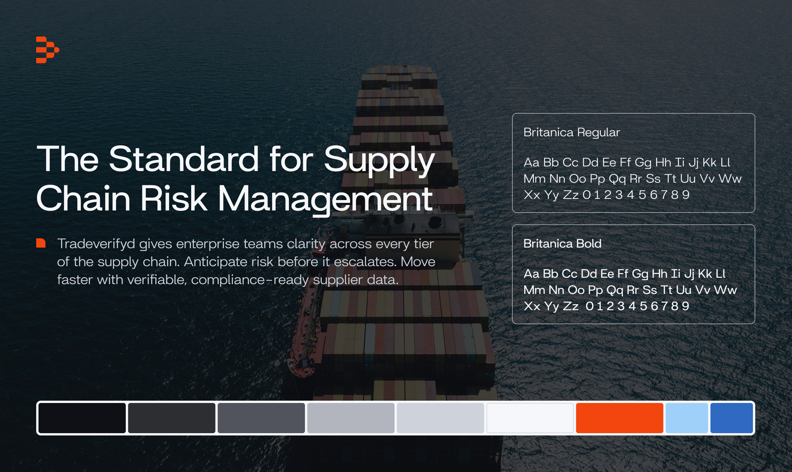
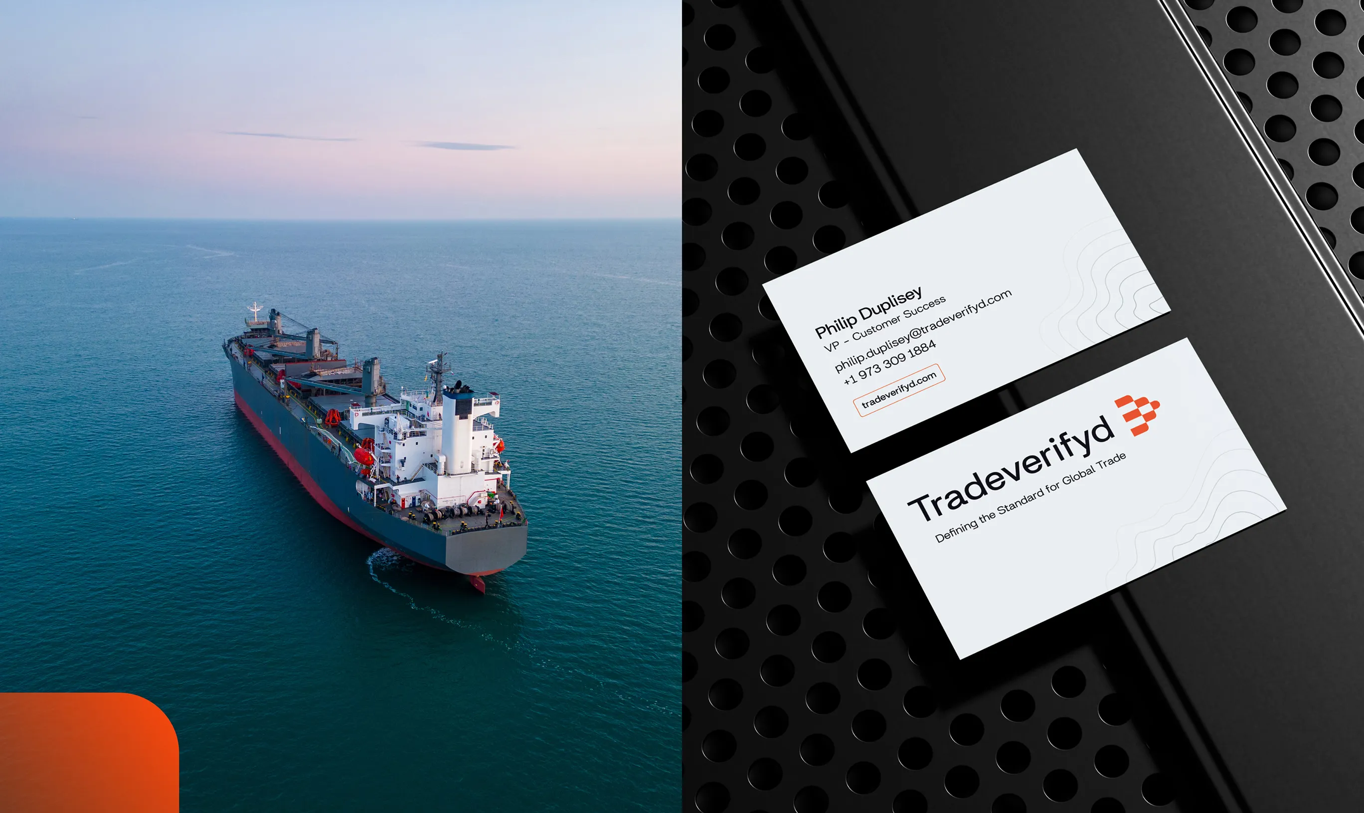
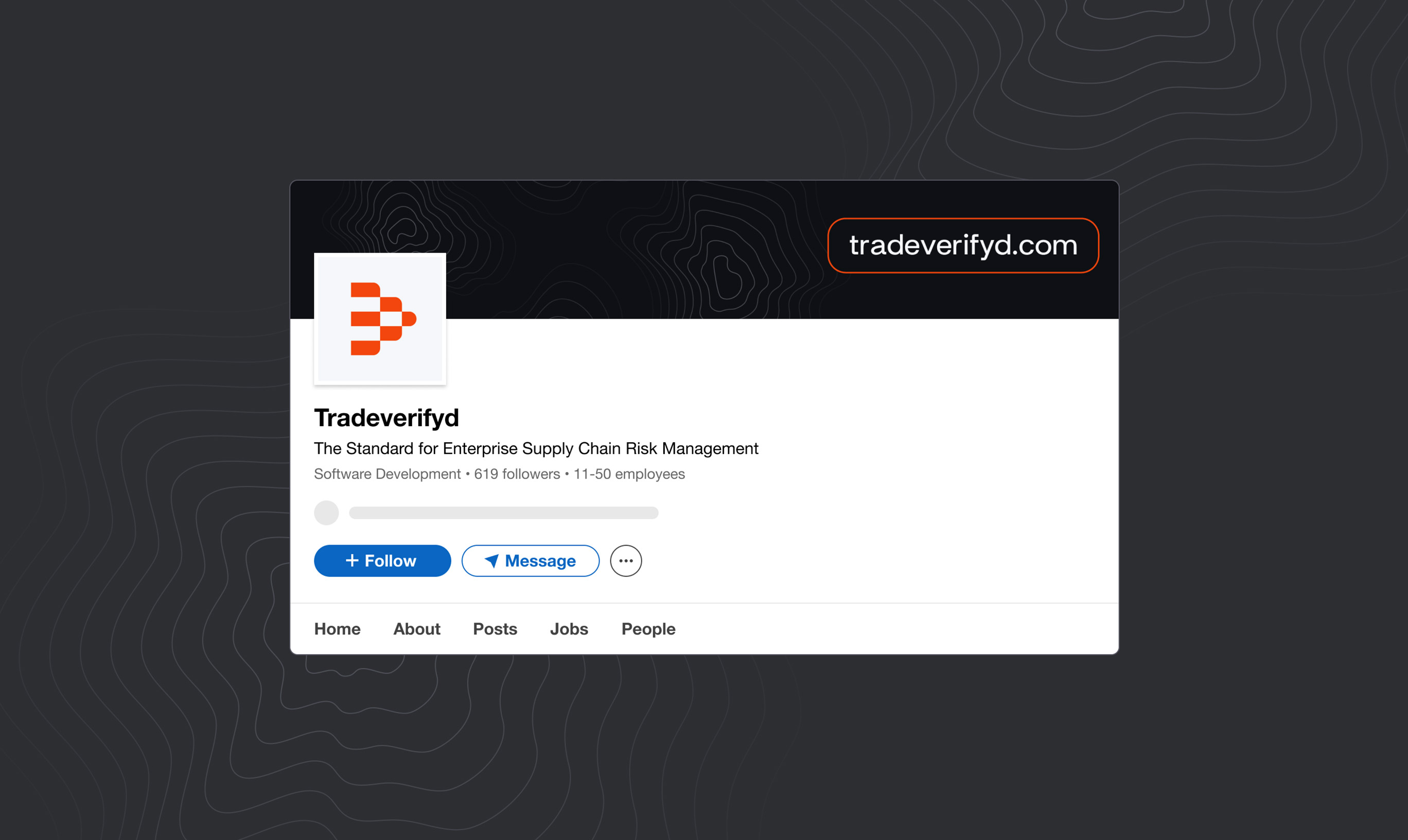
The left to right waterfall flow, visualized in the logo mark, is influenced by the supply chain process. From various distributors, multiple locations, and innumerable personnel, the supply chain narrows at milestones until it meets a final destination. The left to right flow indicates a forward progression, emphasized by the logo mark’s positioning on the right side of the text.
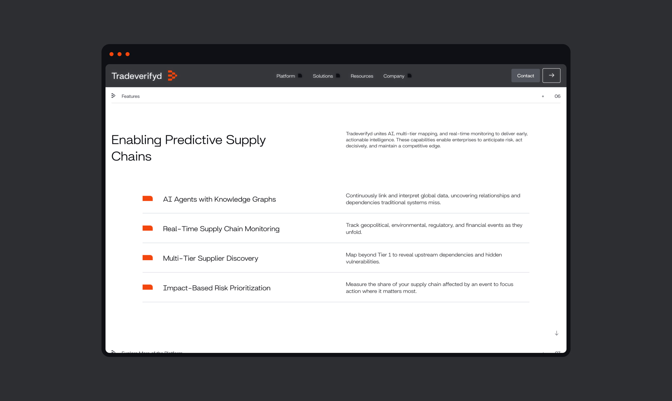
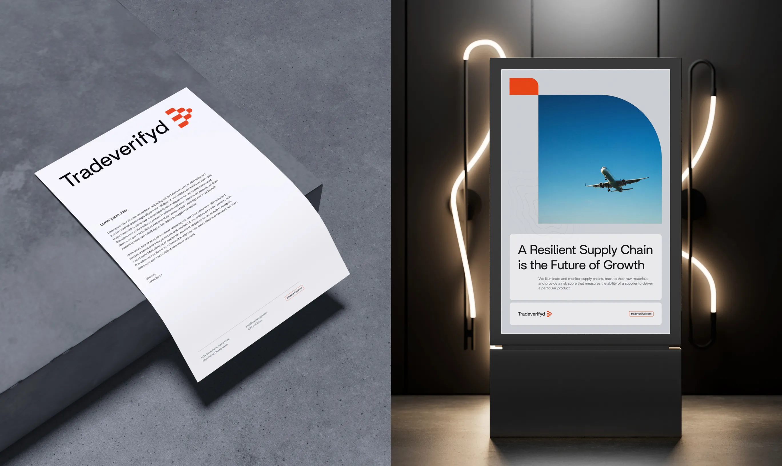
Typography operates on a tight grid with clearly defined hierarchies to achieve connotations of confidence and structure. There’s little to no playing around, it’s got to be direct.
The colour palette is a series of cool greys with an orange accent. This is to achieve a machine-like quality while maintaining the opportunity for high contrast call-outs (see last sentence of paragraph above).
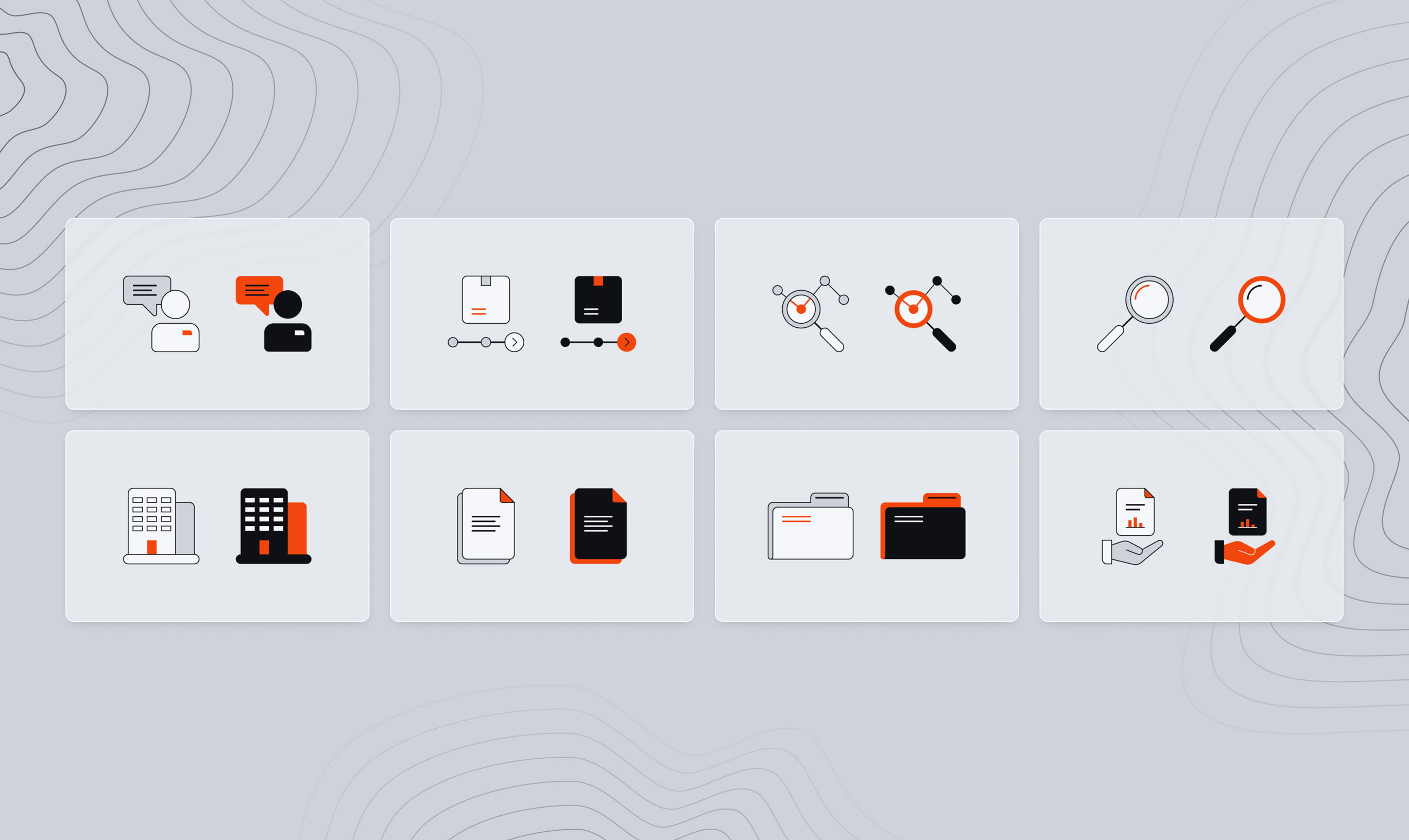
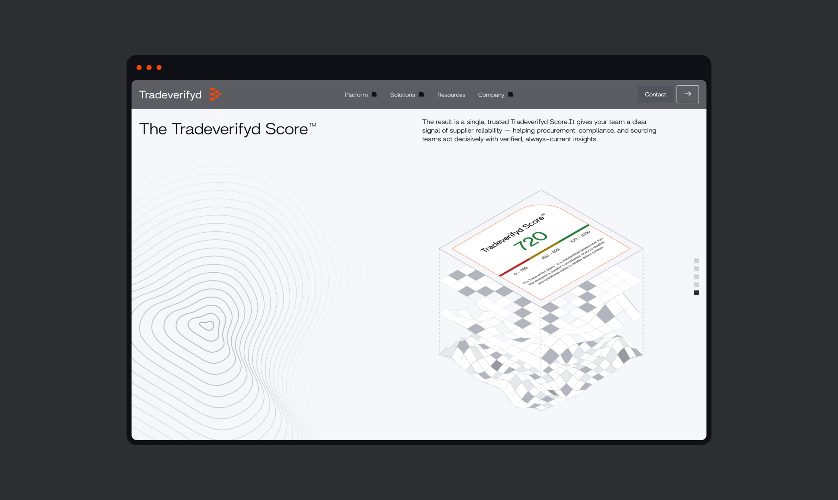
The image curation focuses on visualizing stages of the supply chain transport in clear and open landscapes. There’s nothing obstructing the planes, ships, trains, or trucks. Directions are clear, and cargo is on route. Additionally, there’s topographic map illustrations to be used as background textures, leaning into the concept of navigable space.
Next Project