BOAT

Project Details
About the Project
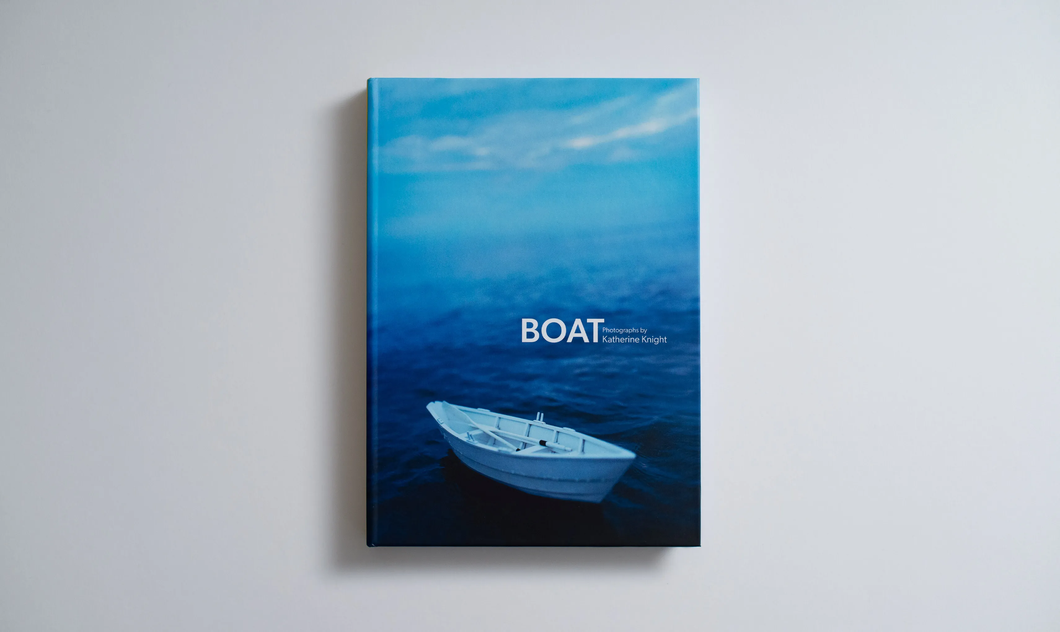
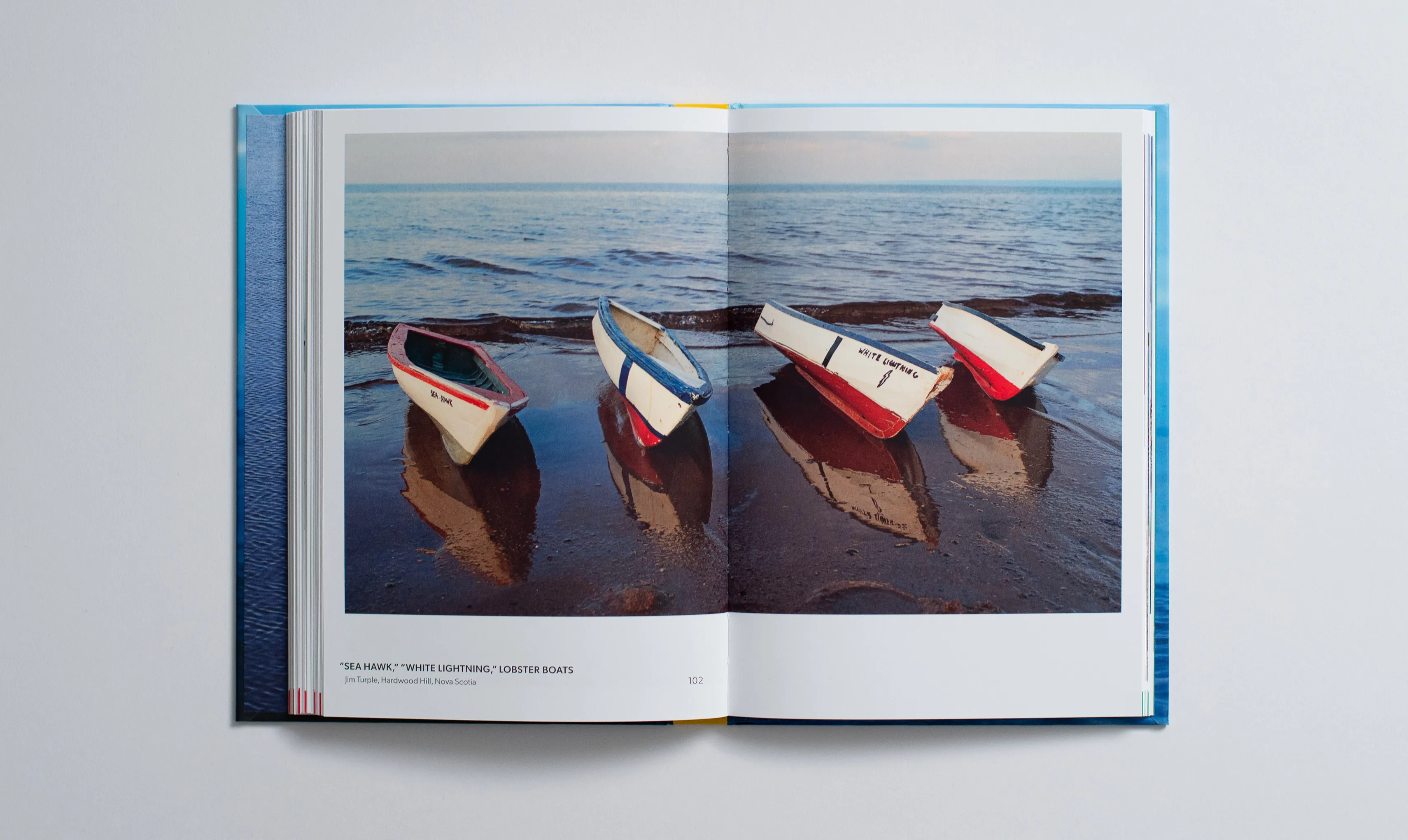
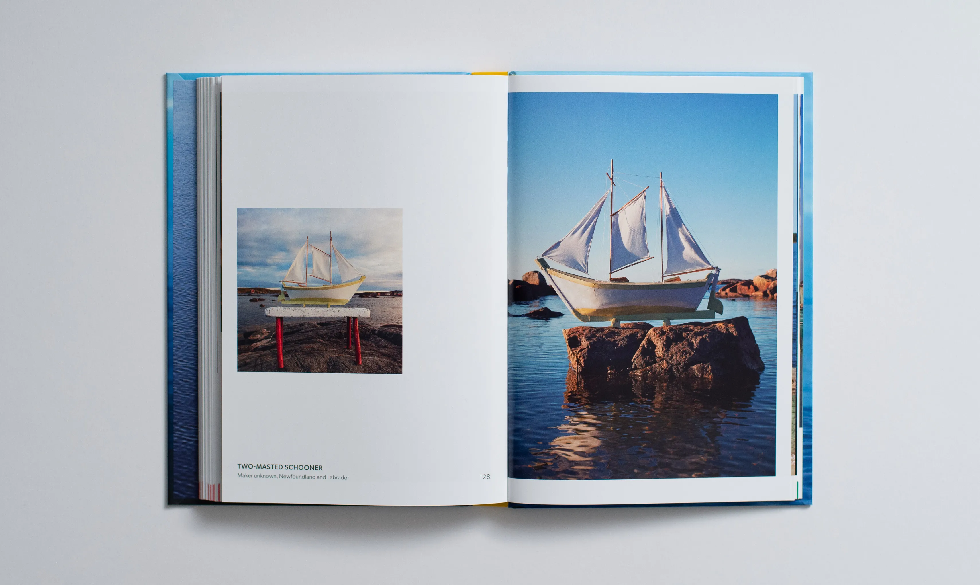
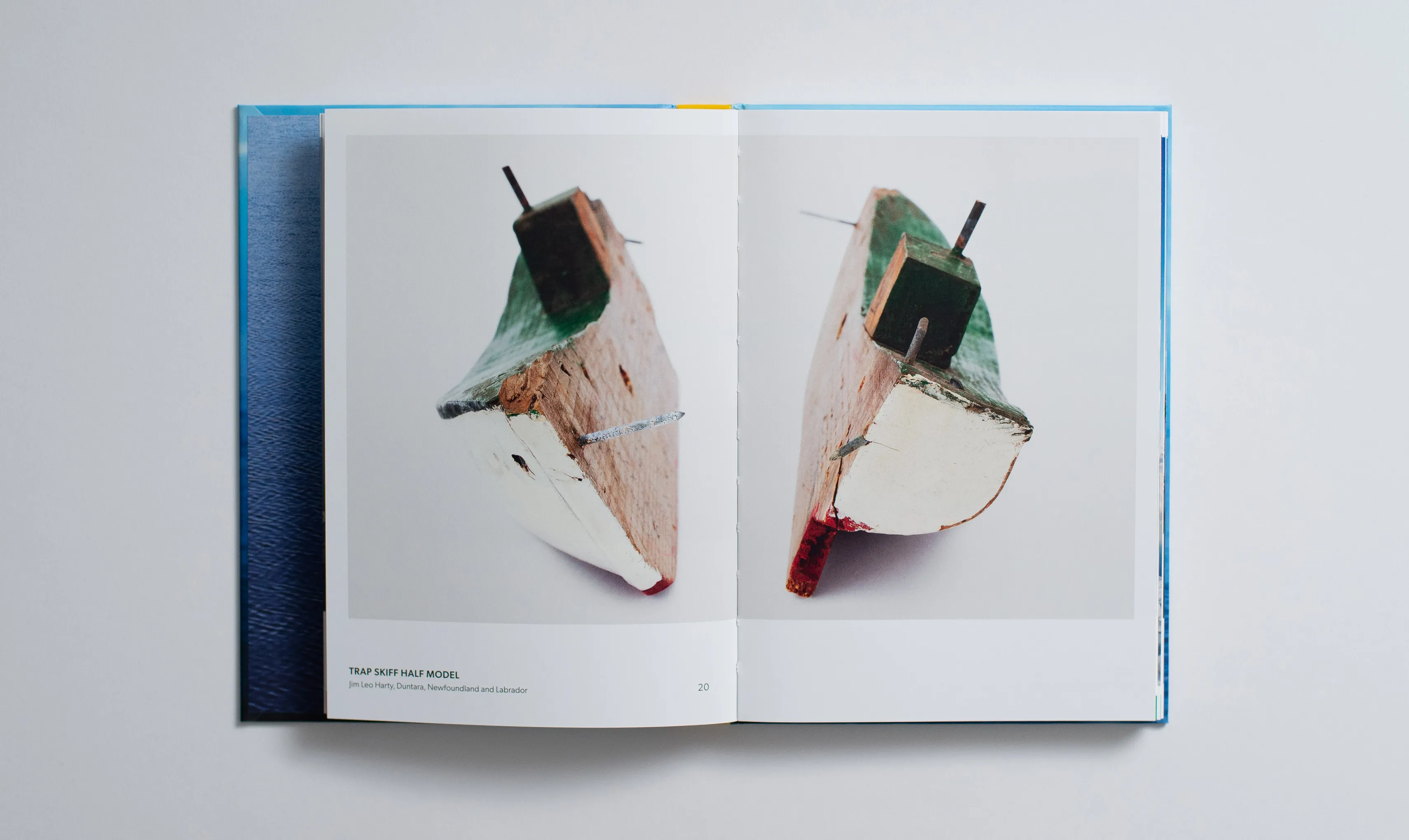
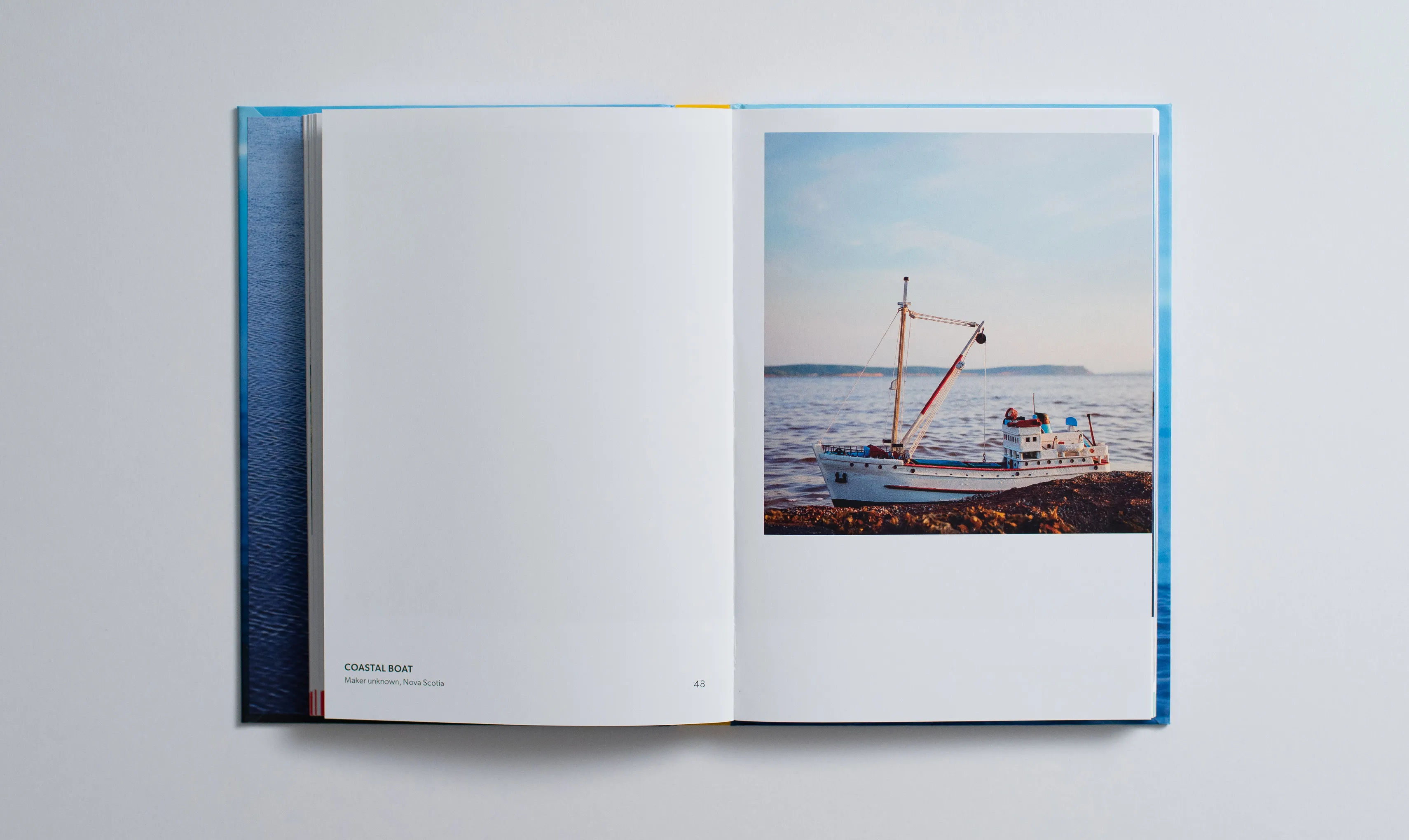
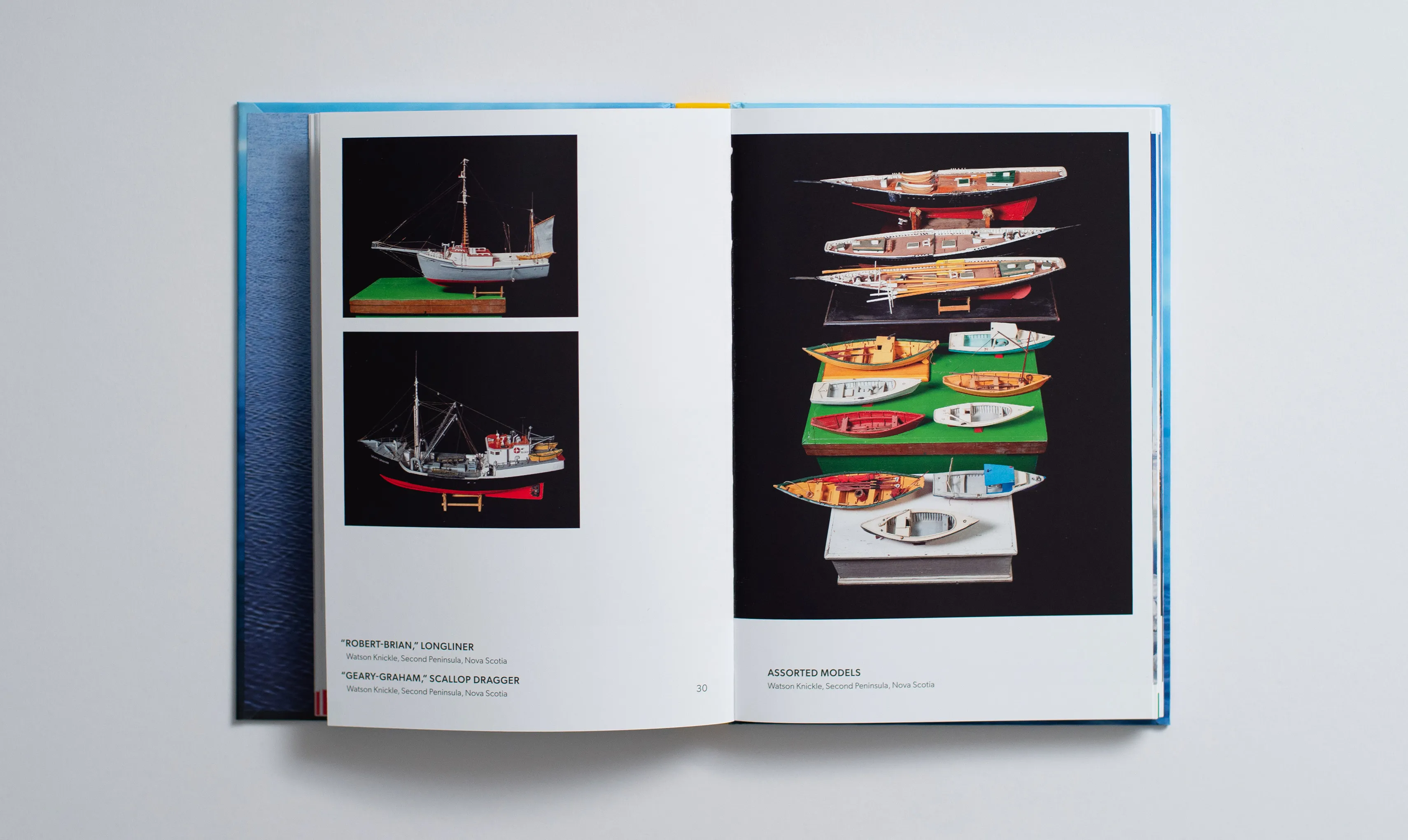
This book centres Katherine Knight’s photographs of hand-made model boats captured in their home seas and shores of eastern Canada and on display. The photographs are supported by narratives from Katherine, model makers, family members of model makers, historians and researches which uncover the historical and sentimental importance of these artefacts. Additionally, there are archival images which illustrate the history and cultural impact of these models and their families.
Katherine describes this photographic work as “capturing the uncanny,” this became a strong conceptual influence on the book design.
Scope & Role
My role spanned from initial concept/layout, defining grid structures, assigning type hierarchies, selecting typefaces, typesetting and image placements, over 50 file revisions (I have the .indd files to prove it), right up to hand-off for printers to take the reins. Of course, all of the decisions around these aspects were made in a tight collaborative and continuous conversational process with Katherine Knight.
Concept & Execution
The books design takes influence from the uncanny, focusing on an asymmetrical structure and variable layout logic. Photos are at the forefront and text is kept tight and clean with the odd deviation.
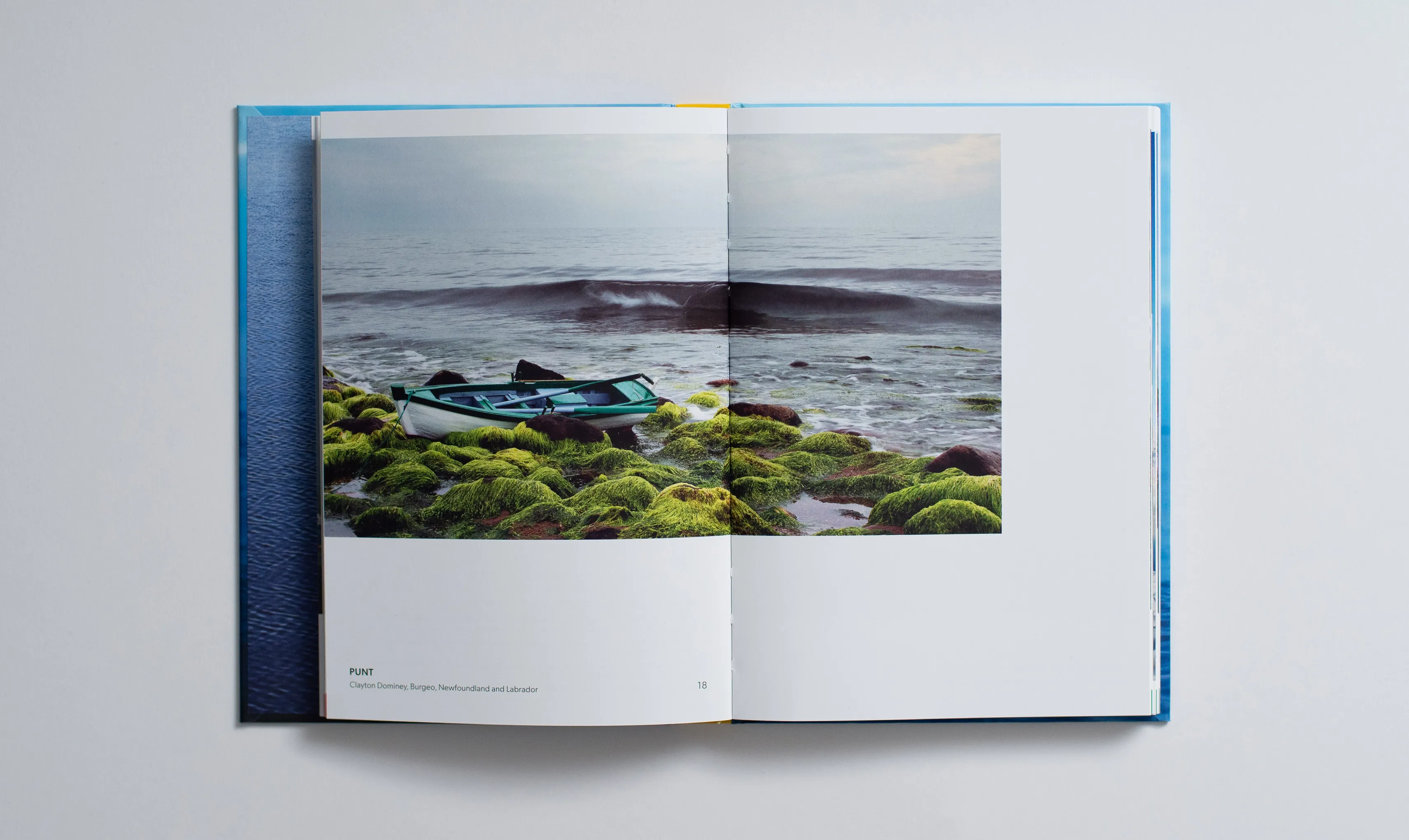
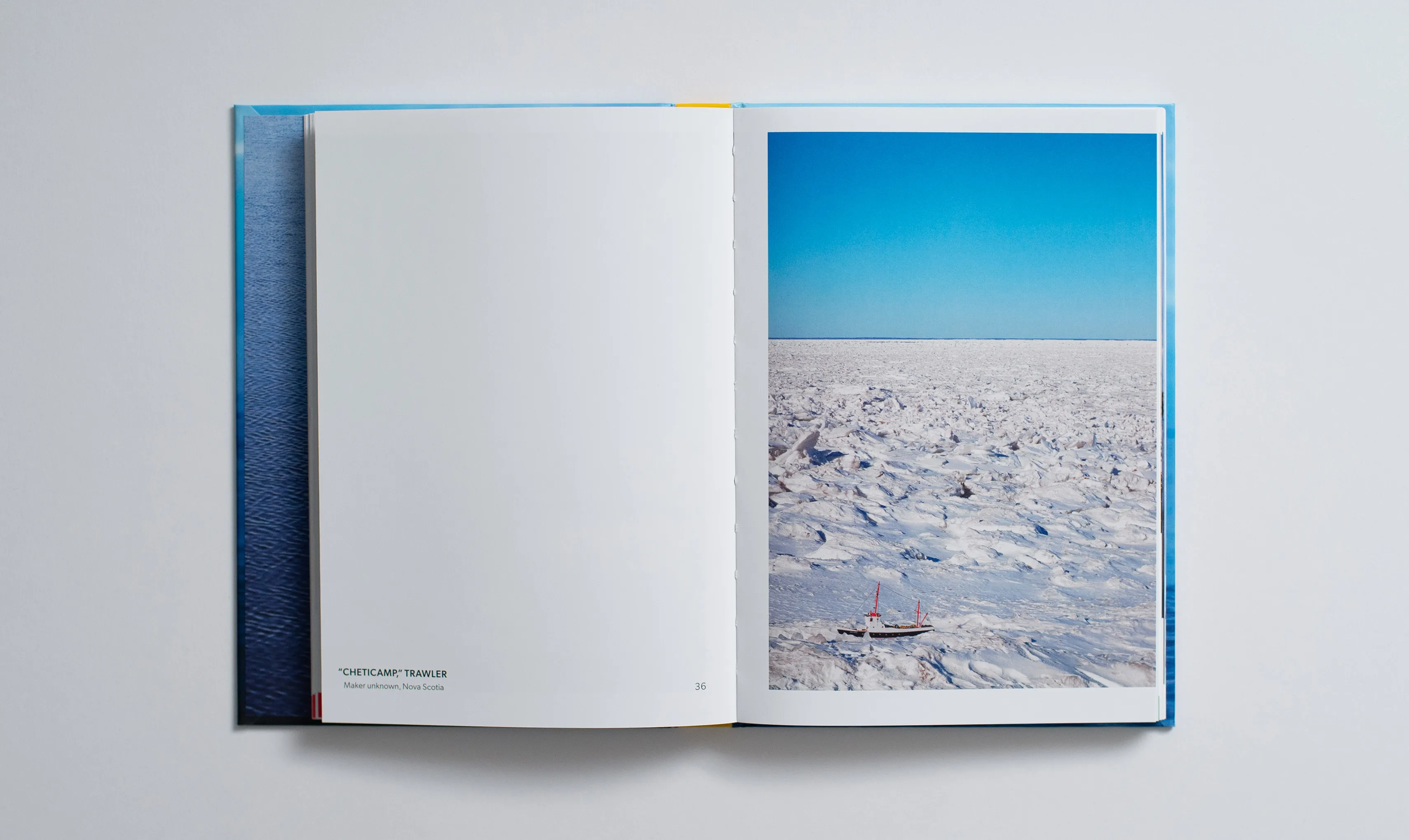
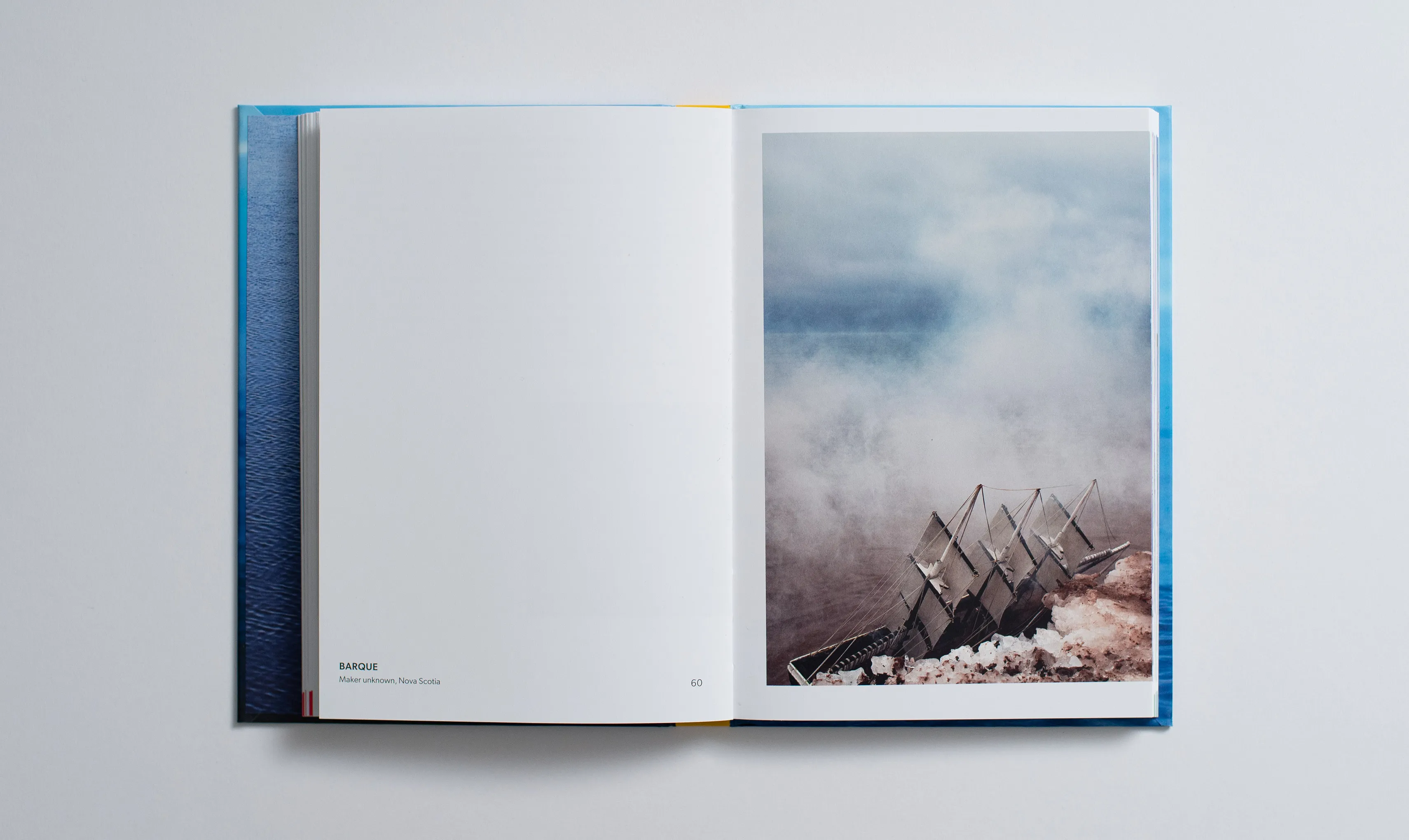
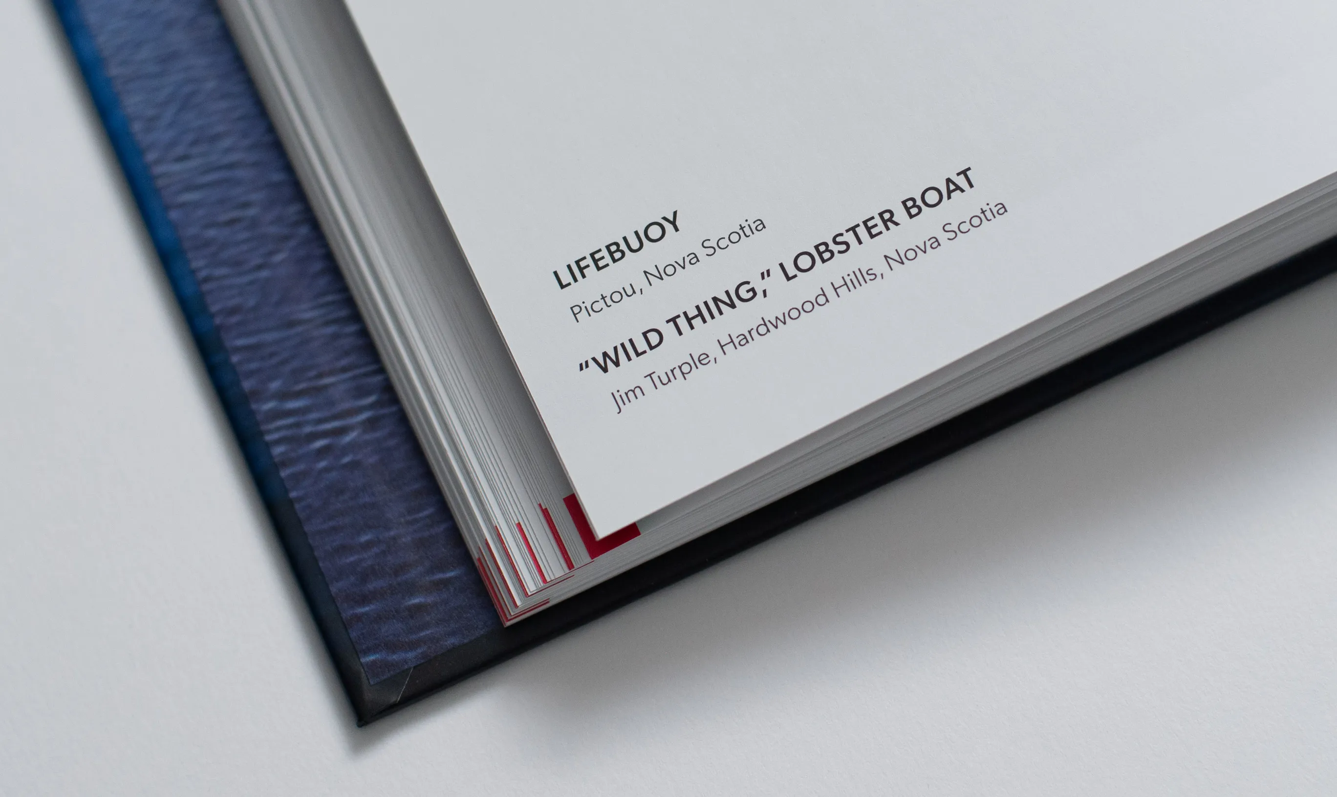
There are two primary groups of spread designs, the photographic and the narrative. The photographic spreads have a few variants which respond to the number of images in the spread, the ratio of the image, and the boat and/or horizon’s position in the image. Typography is kept consistent in these spreads as to not draw attention away from the photos. By utilizing these variable layouts, as a person flips the pages there’s a short term unexpectedness to the experience, but also an overall consistency.
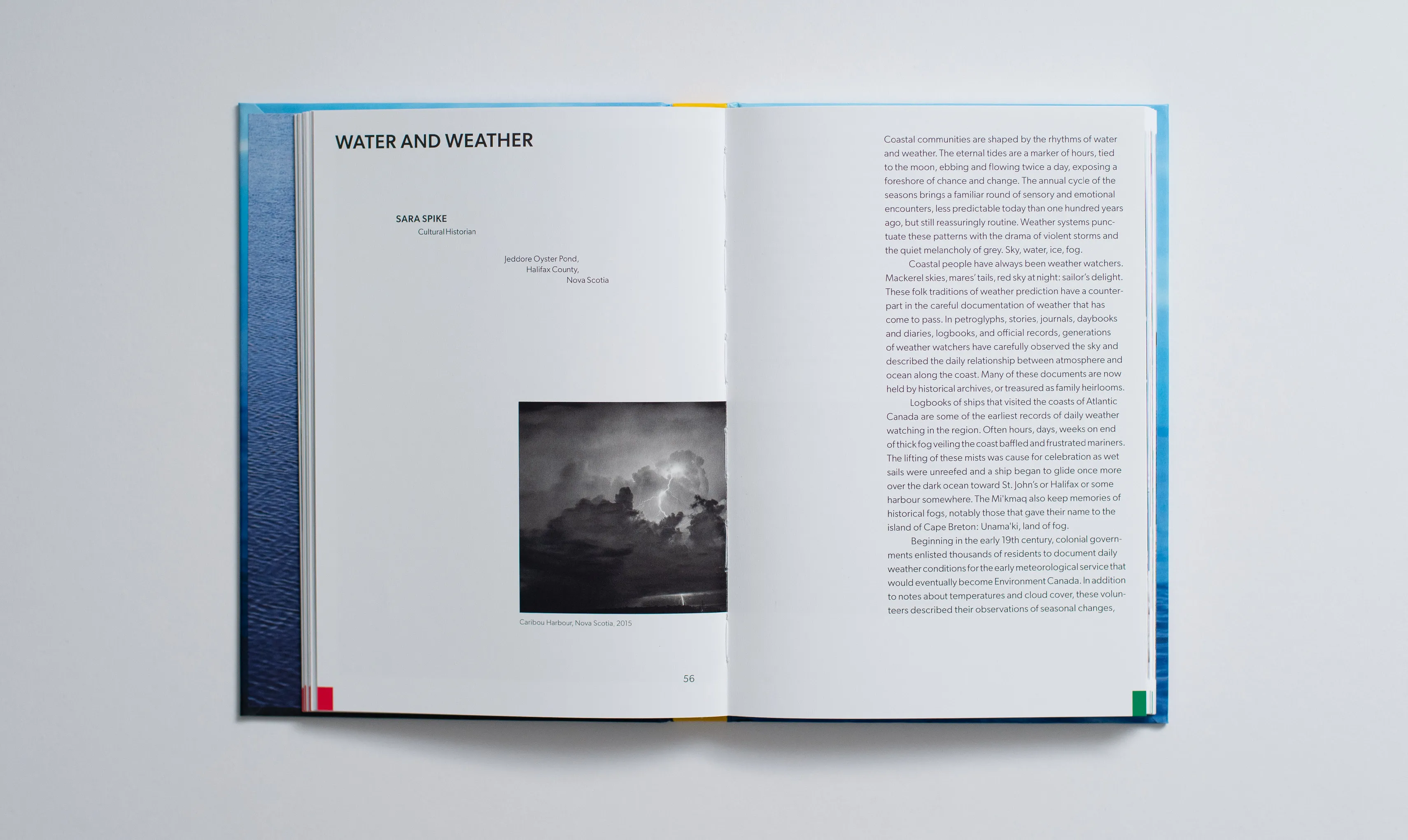
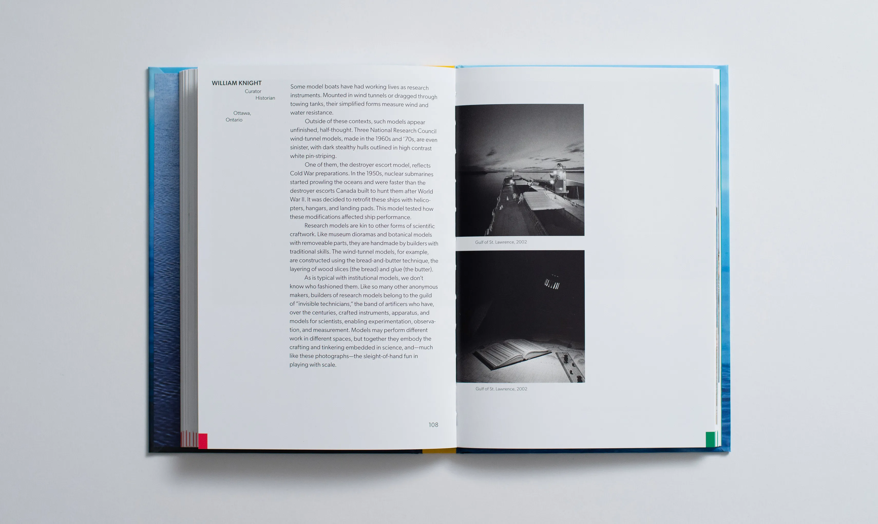
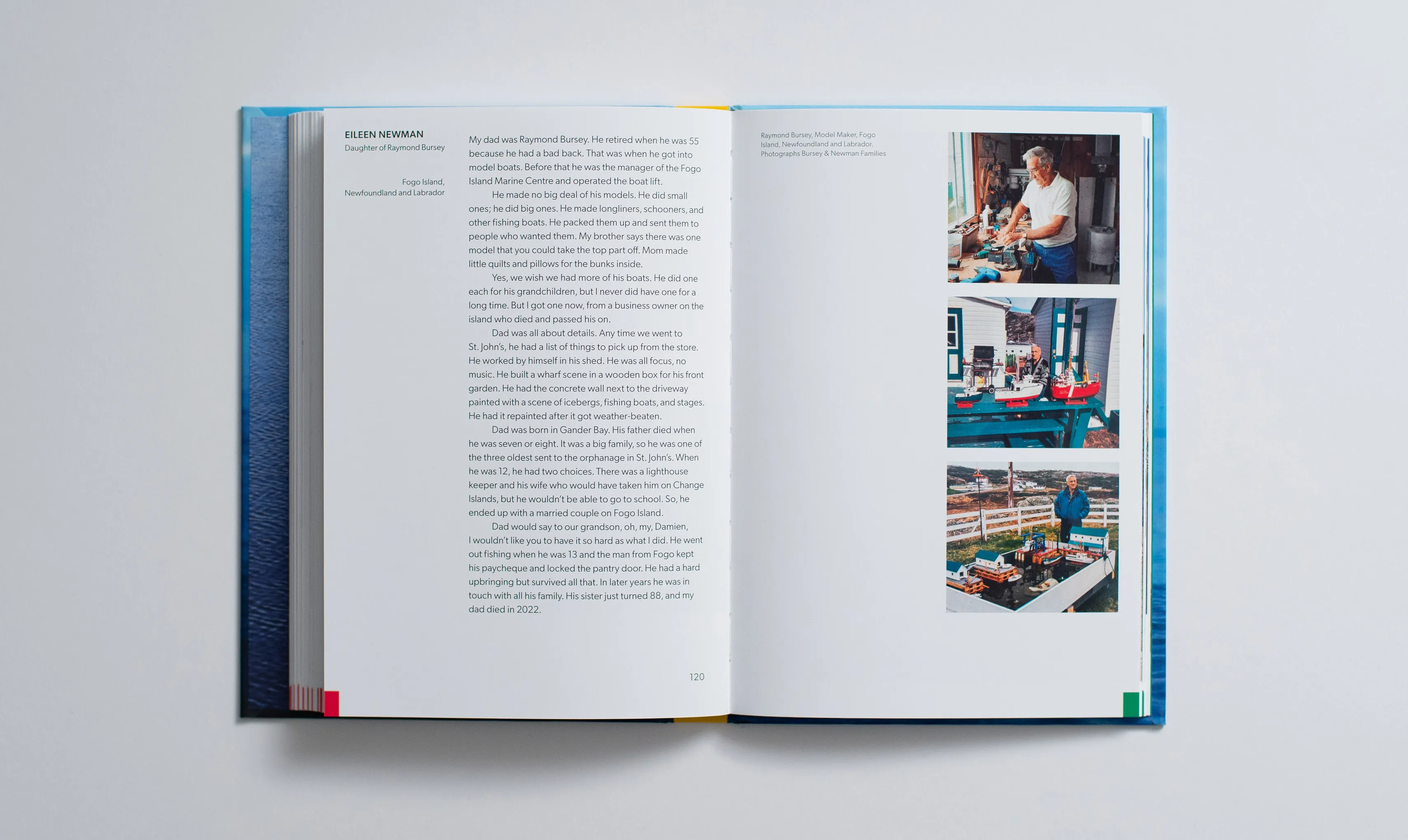
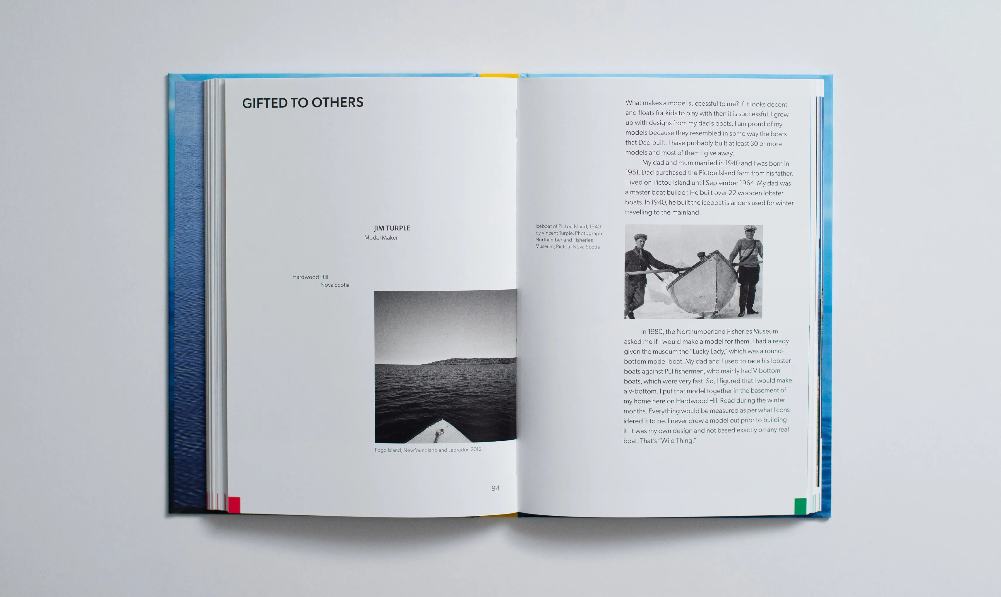
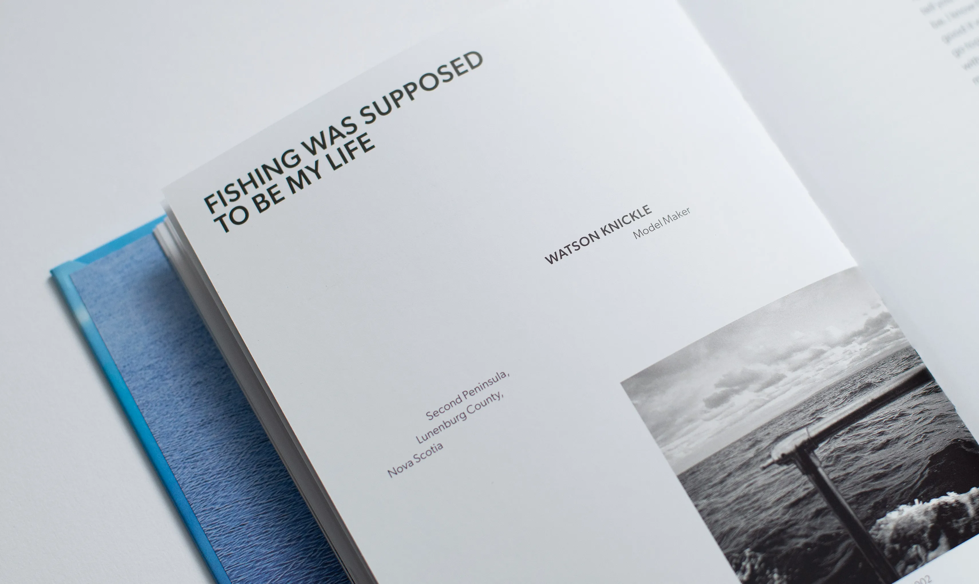
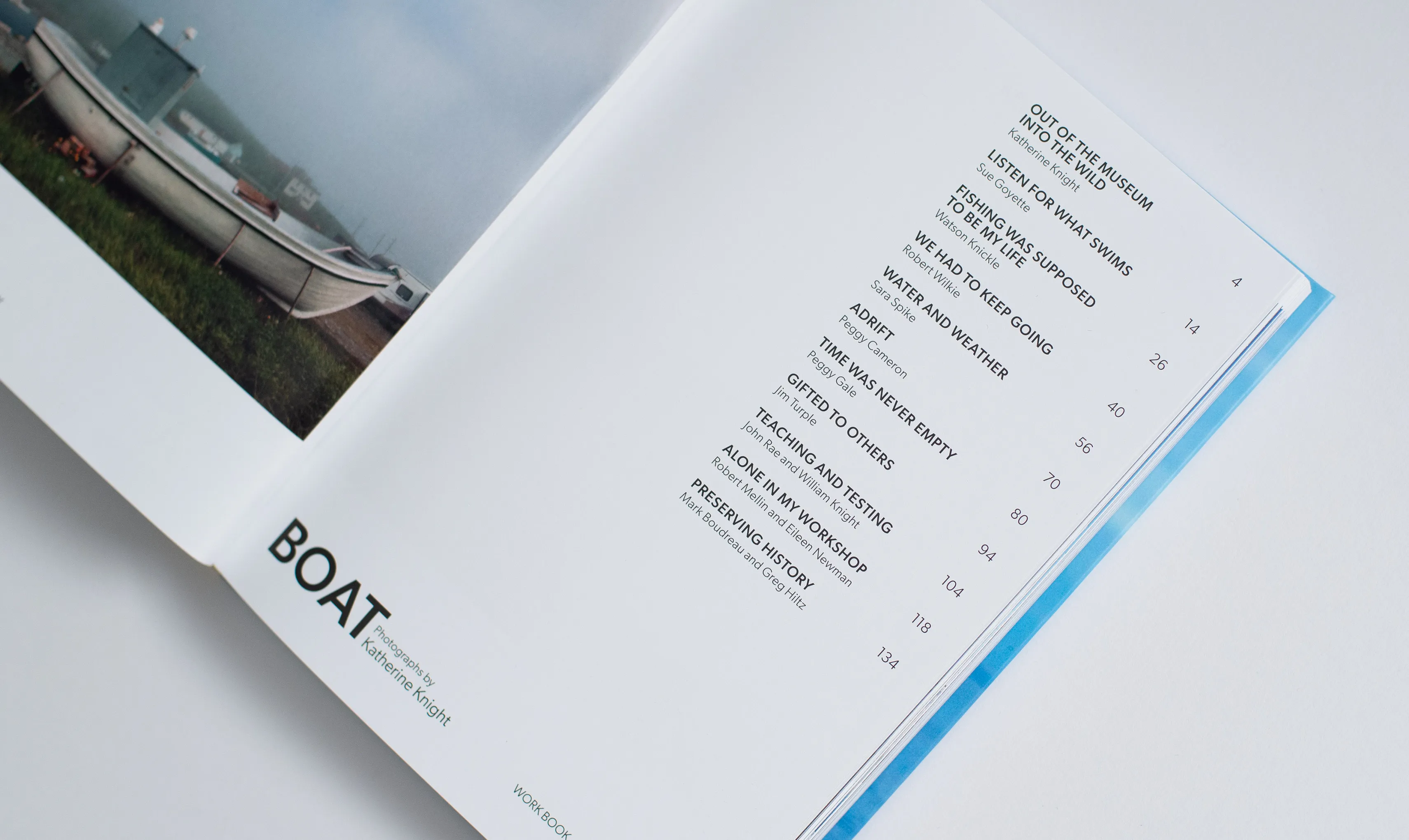
The narrative spreads keep titles, black and white images, and long text well structured and consistently positioned, while author lines and descriptions deviate to flow across the page, each in their own unique way. If there’s supporting imagery for narratives, these are integrated into the flow of text on an individual basis. The combinations of structures and deviations allow each narrative to have it’s own unique elements.
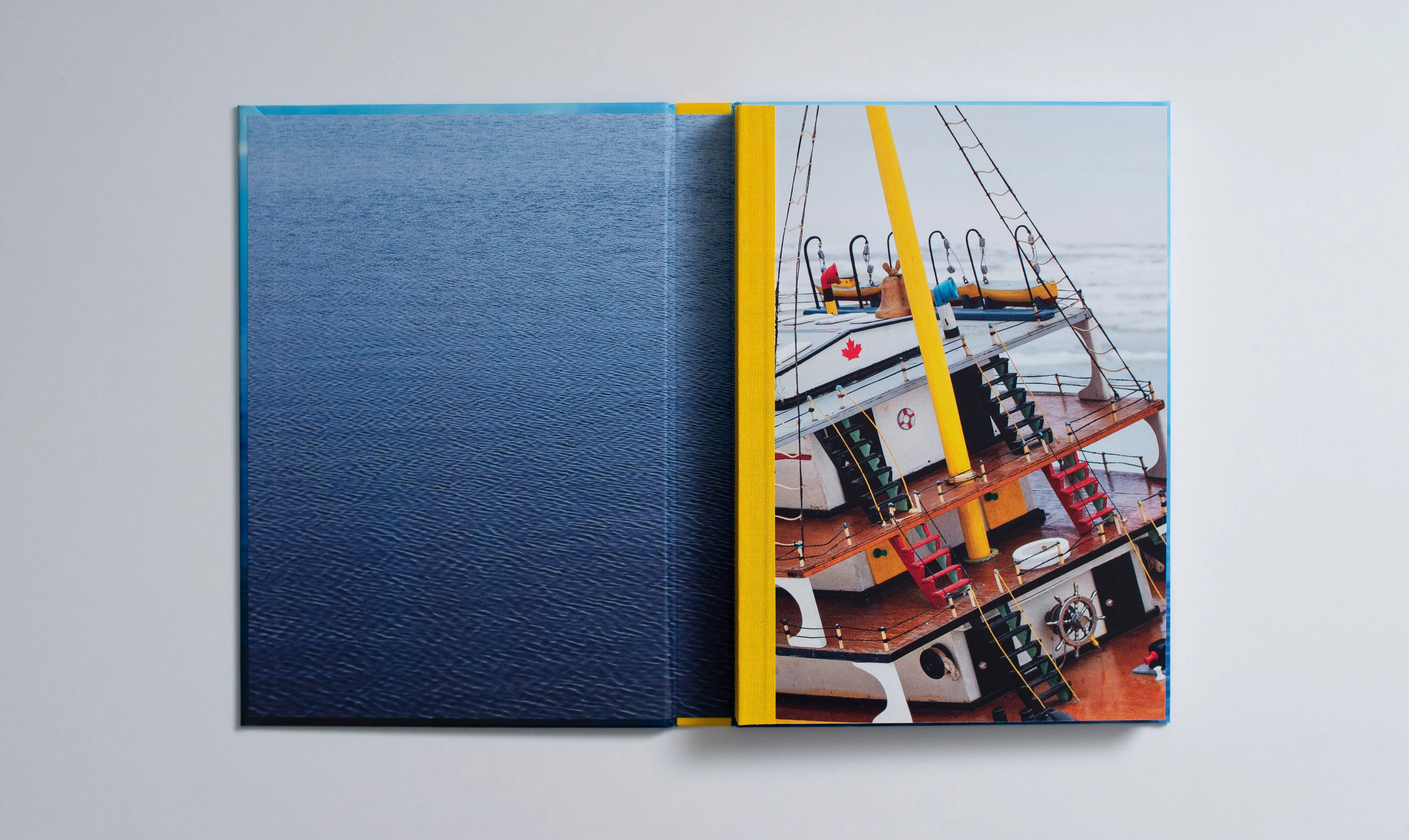
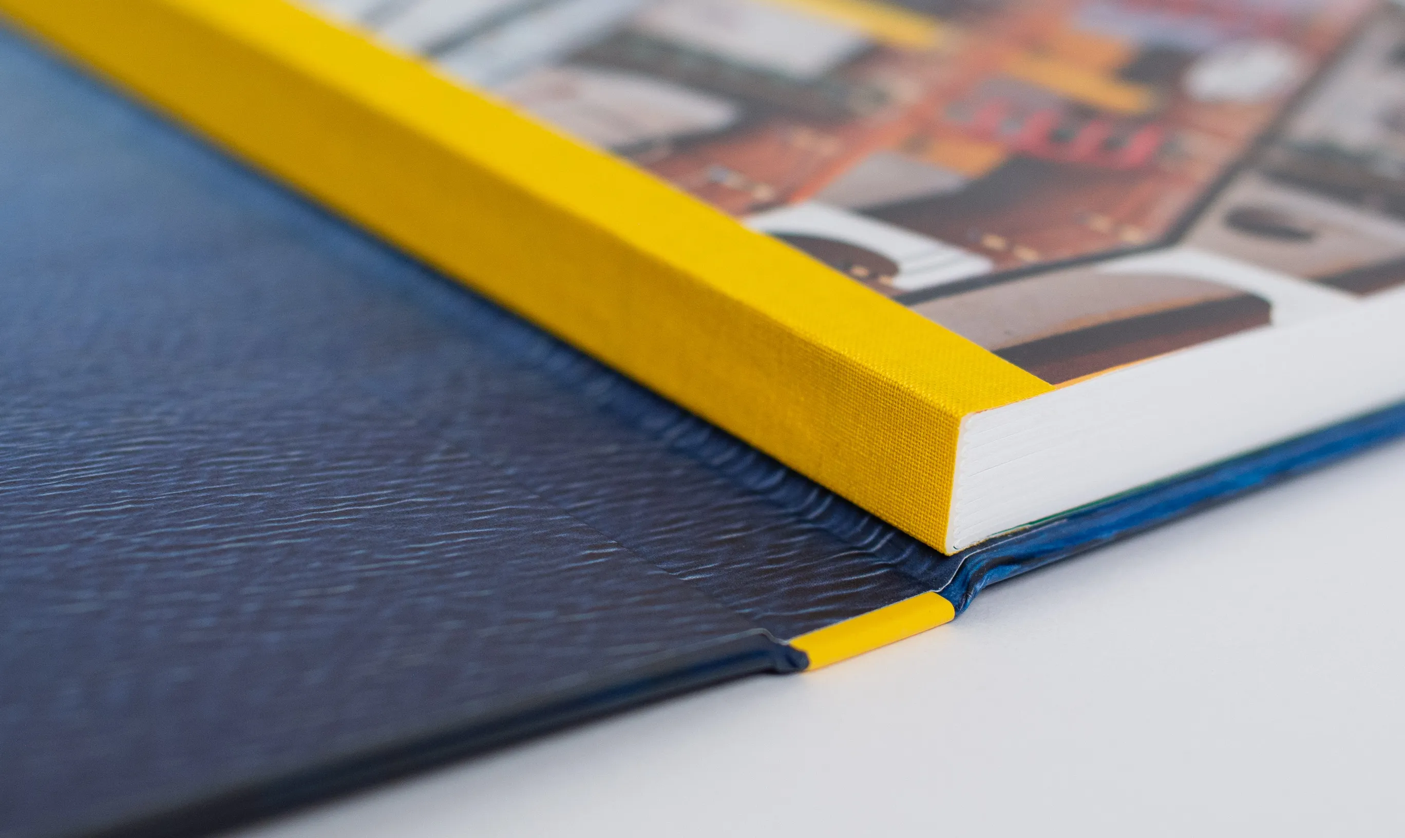
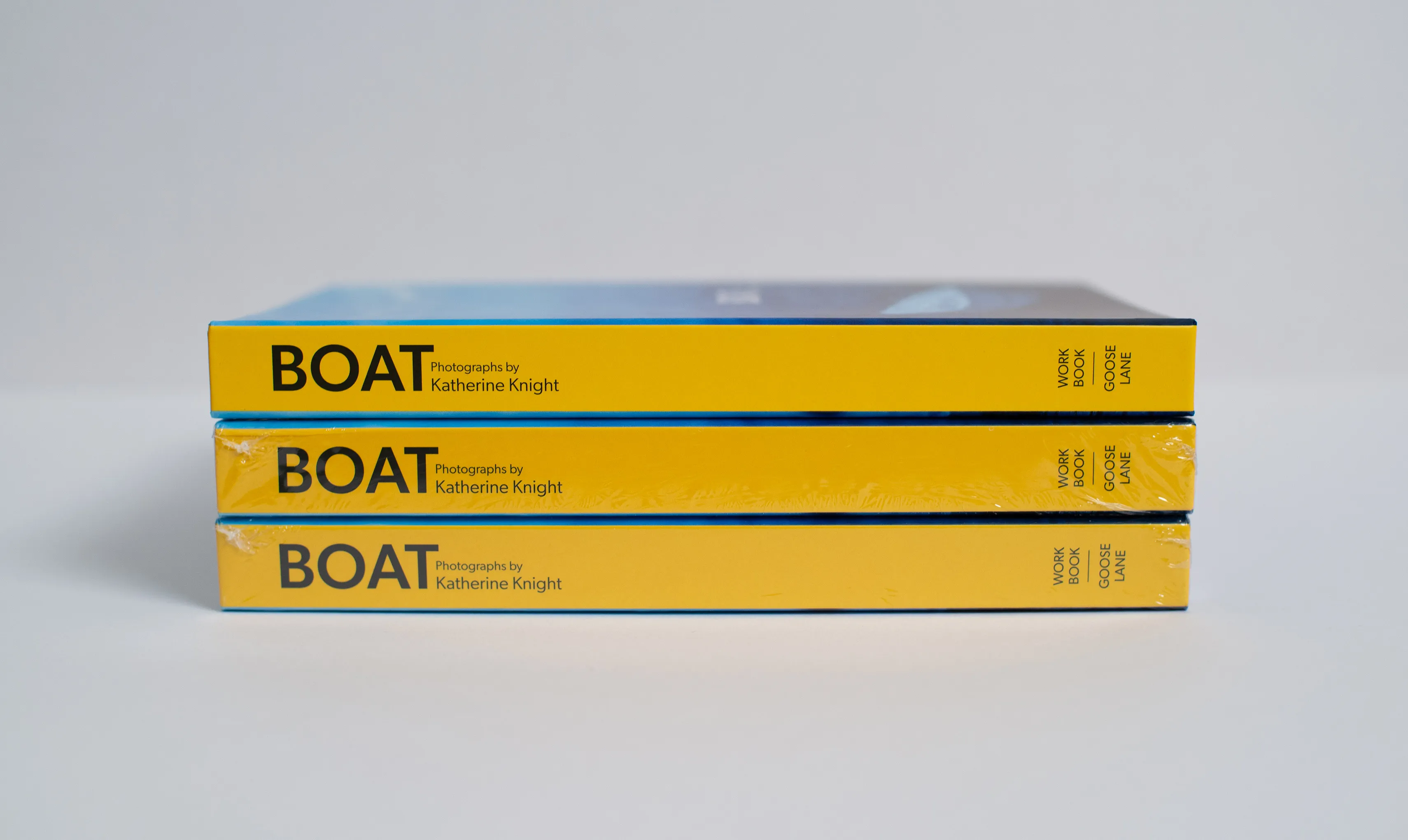
The physical book is swiss bound, able to lay flat and reduce the folded image area lost to perfect binding. The cloth used for wrapping the sewing of the text block is a bright yellow, matching the yellow on the outside spine, an off-the-cuff colour decision that Katherine and I felt right about.
These design decisions all contribute to delivering an experience of the uncanny. It’s a book design acting as a vessel for Katherine’s photographs and the narrative texts to come together and tell their story of eastern Canadaian culture.
Next Project