VoiceLove


Project Details
About the Project
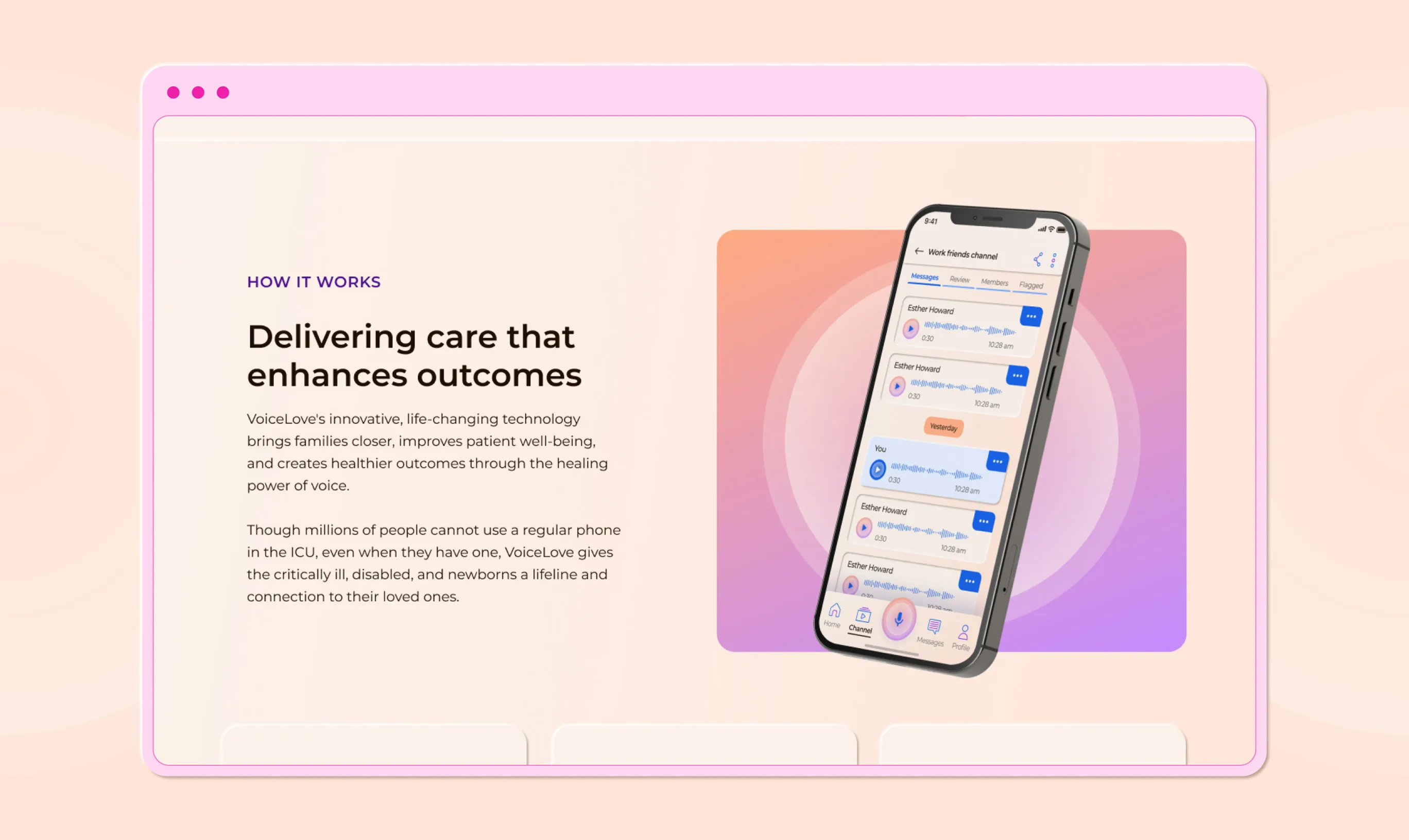
VoiceLove’s product is a voice-to-voice communication mobile application that allows individual and multi-channel participants to record and listen to voice messages. Their research on loneliness and isolation, prompted by the COVID-19 pandemic, found that there’s mental, emotional, and physical healing potential in vocal communication. With VoiceLove, connection to loved ones is conveniently facilitated while isolated in a care facility.
Scope & Role
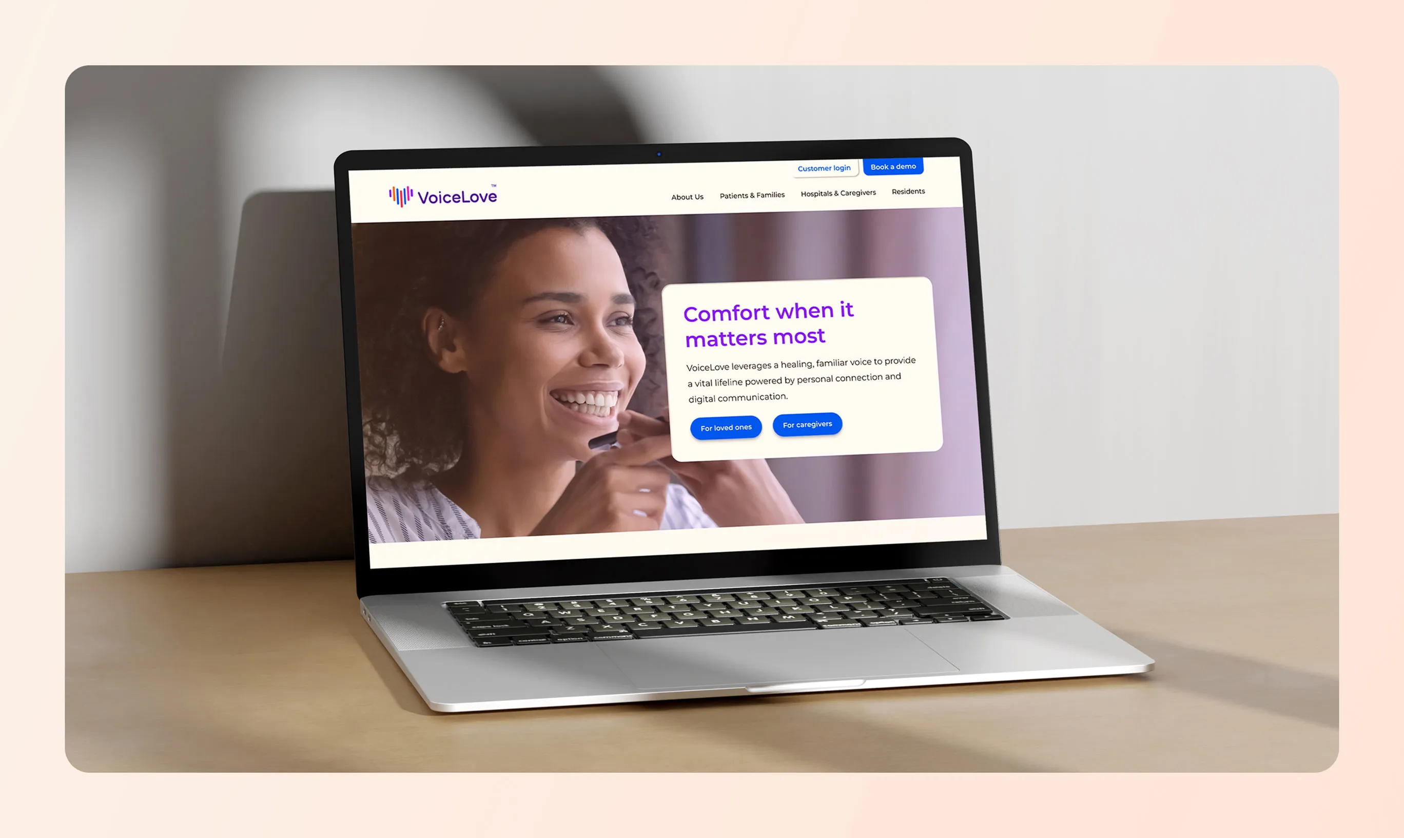
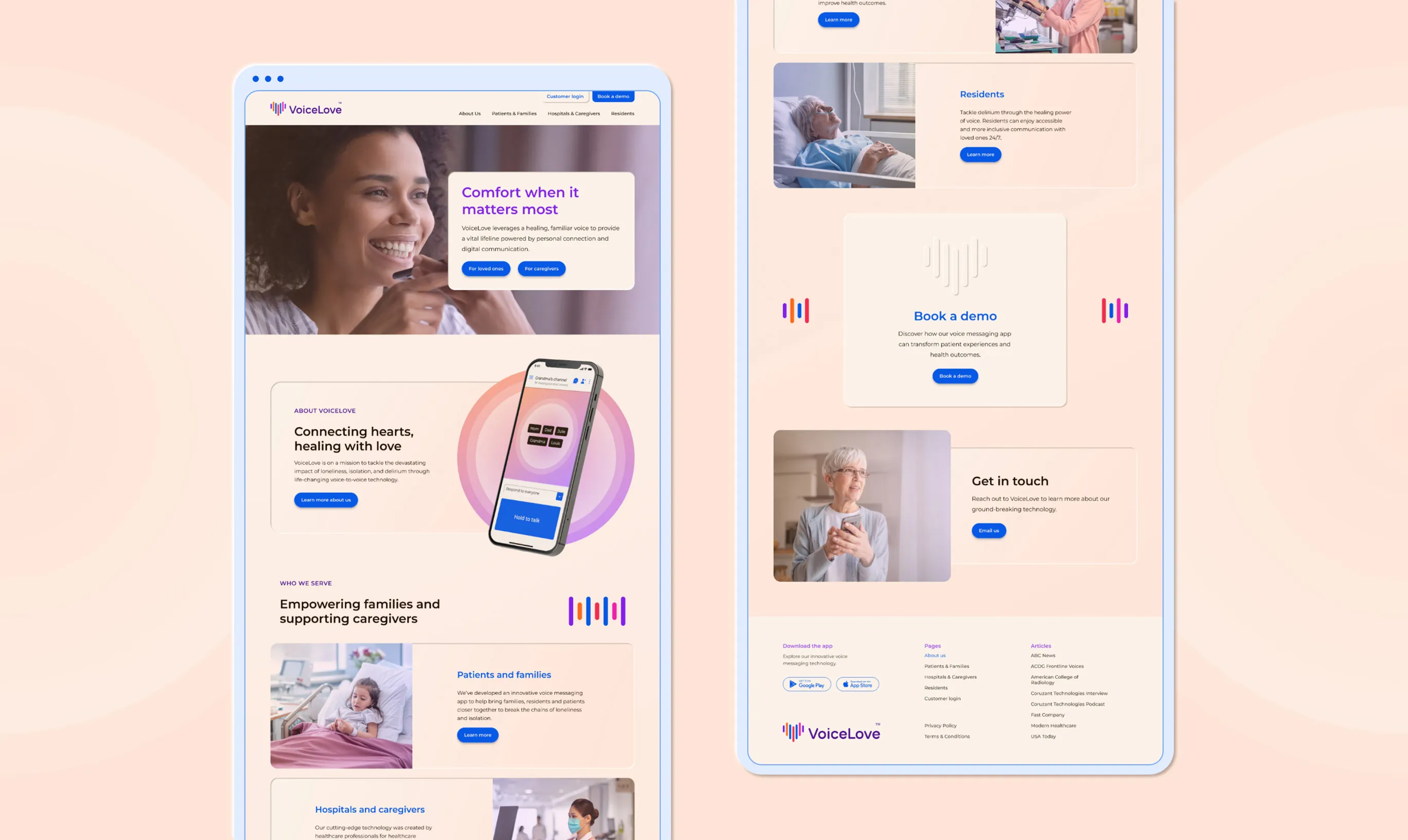
VoiceLove approached Wunderdogs for strategy, messaging, visual identity, and web design. My role was to design and deliver a visual identity system, design the website, and design and write the brand book.
Concept & Execution
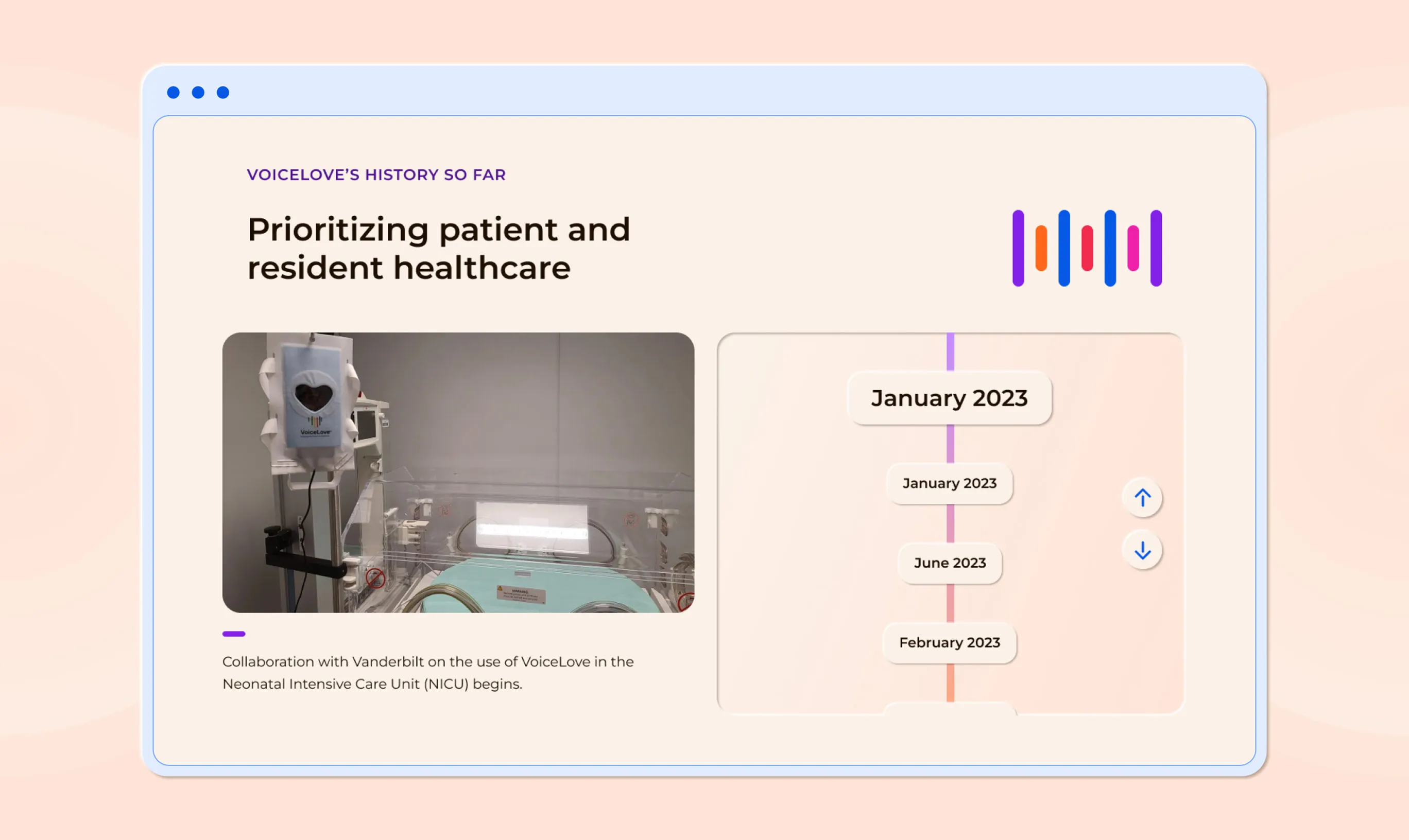
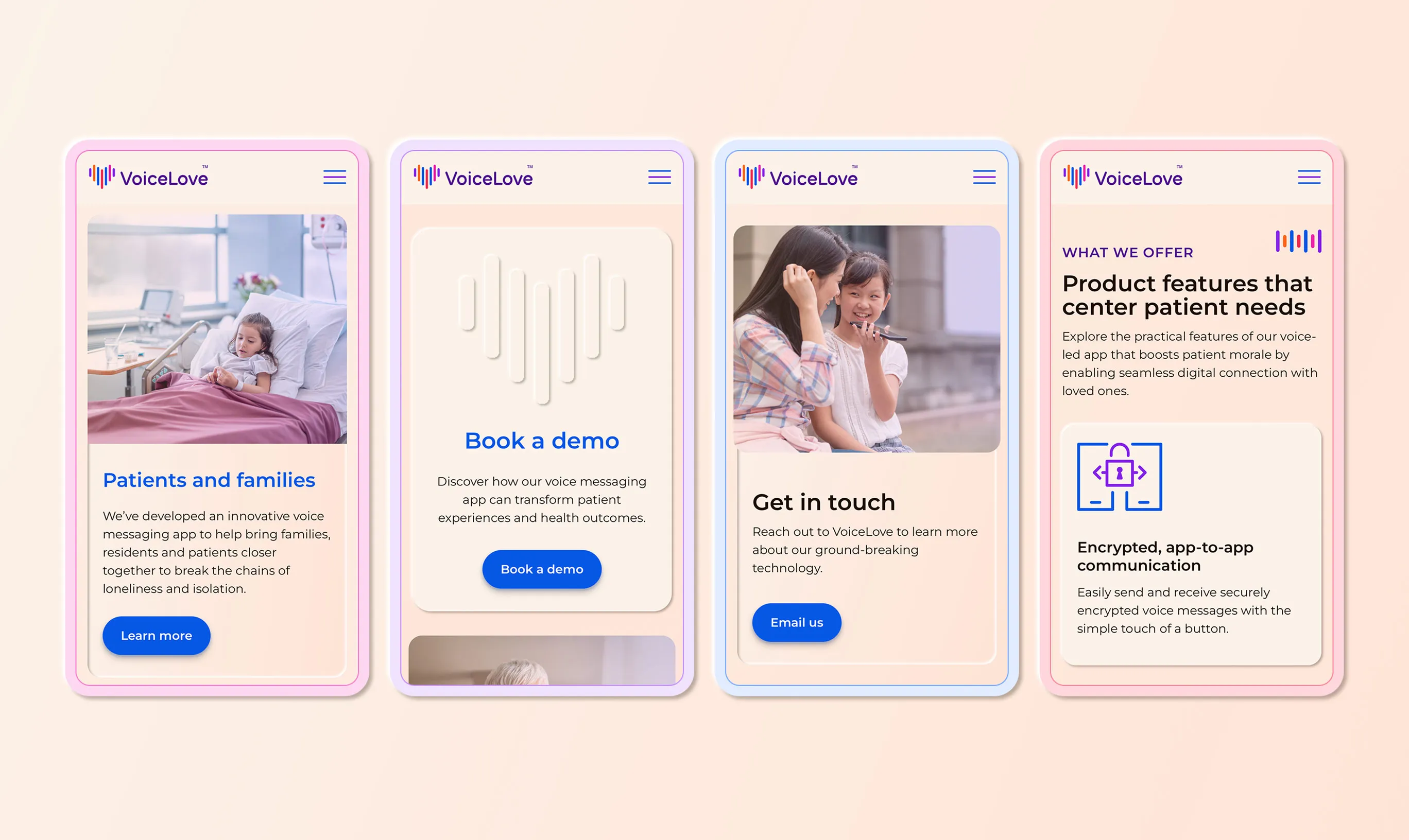
The identity acknowledges it’s presence in the medical space while inviting in a caring sense of warmth, positivity, and diversity. A unique note on the identity is the use of highlights and shadows to simulate an emboss and deboss effect. With this treatment boundaries are soft (as oppose to contrasts produced by solid fills or outlines), there is separation but connection is not lost.
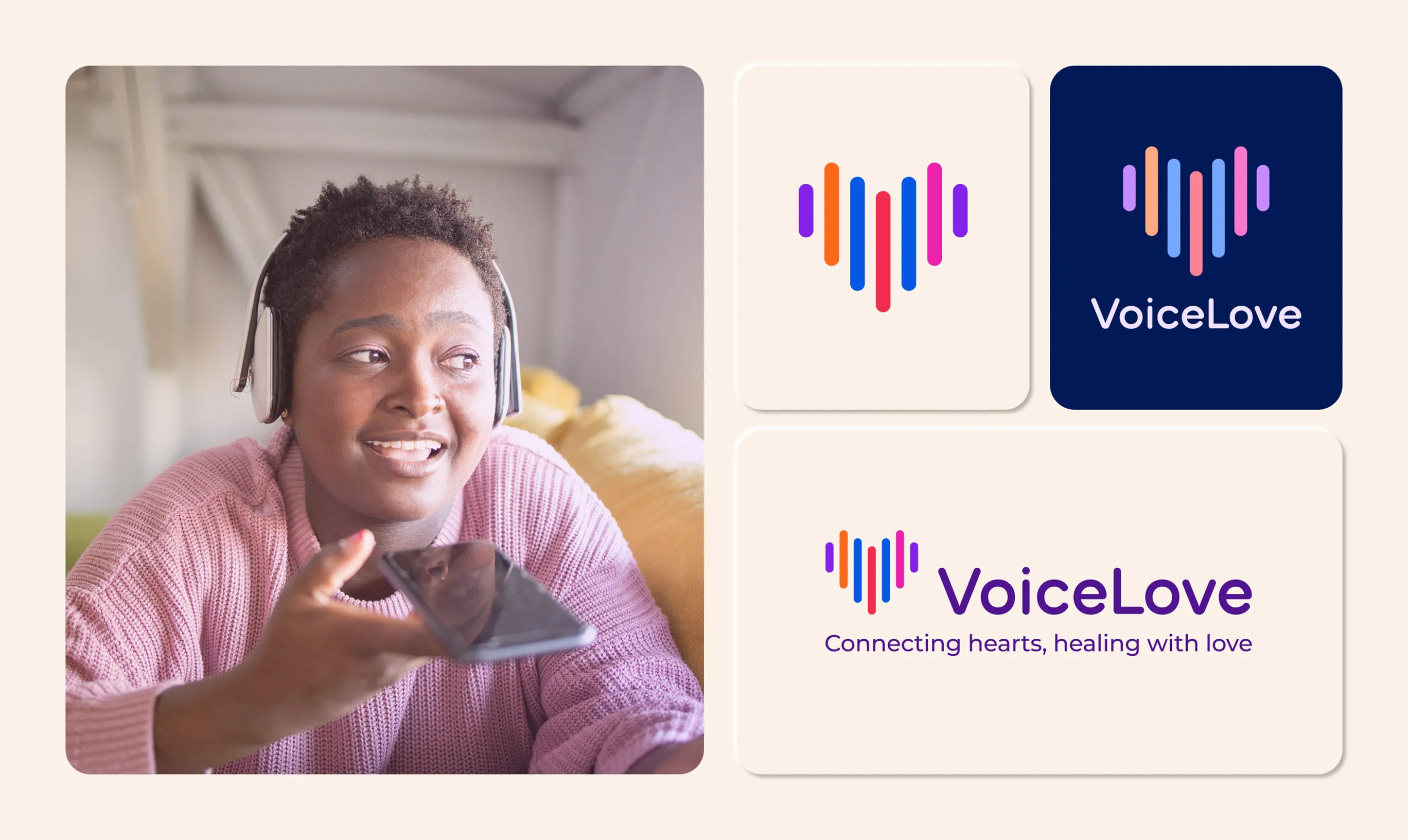
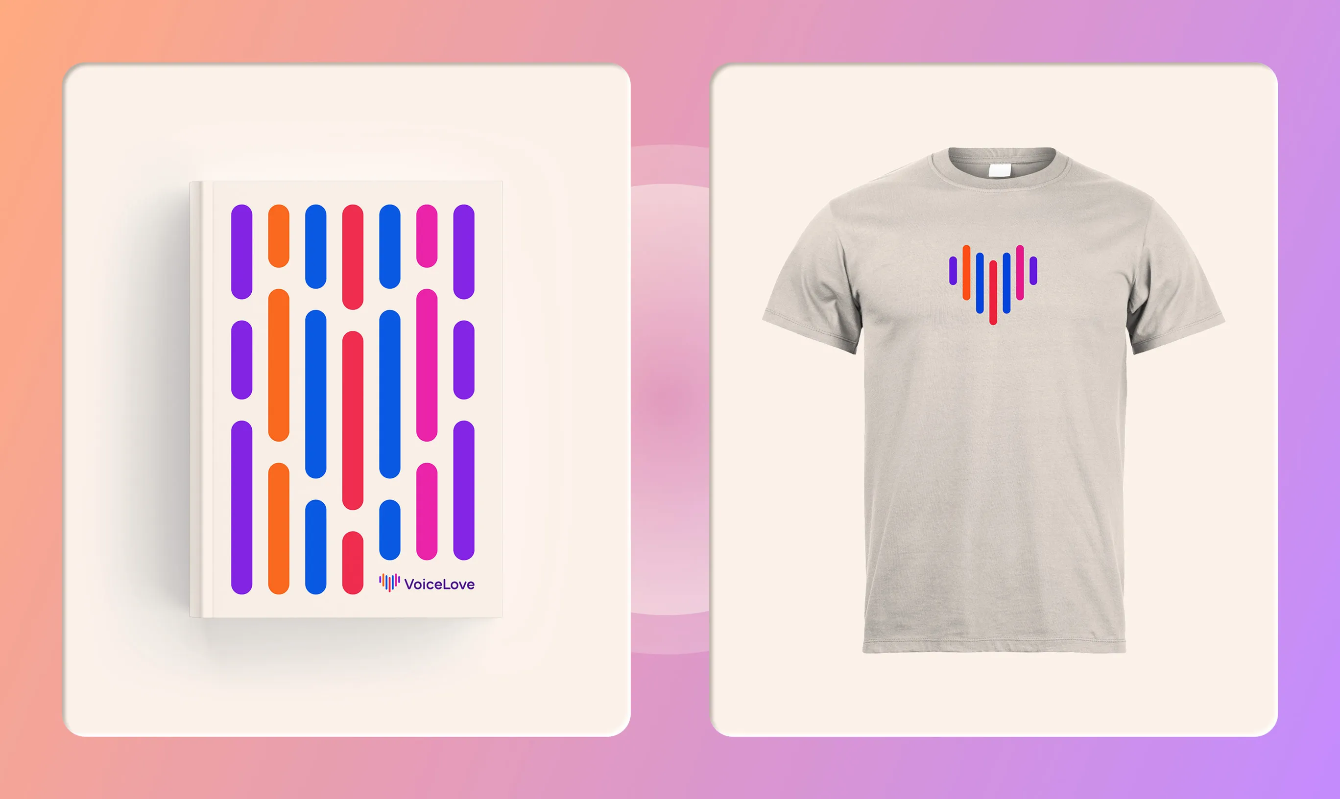
The logo is an evolution of what they were using previously, as the VoiceLove team had a strong connection to it’s form and concept. The logo mark was redrawn to be simplified and the logo type customized to harmonize with the sturdy, yet soft, nature of the heart shape.
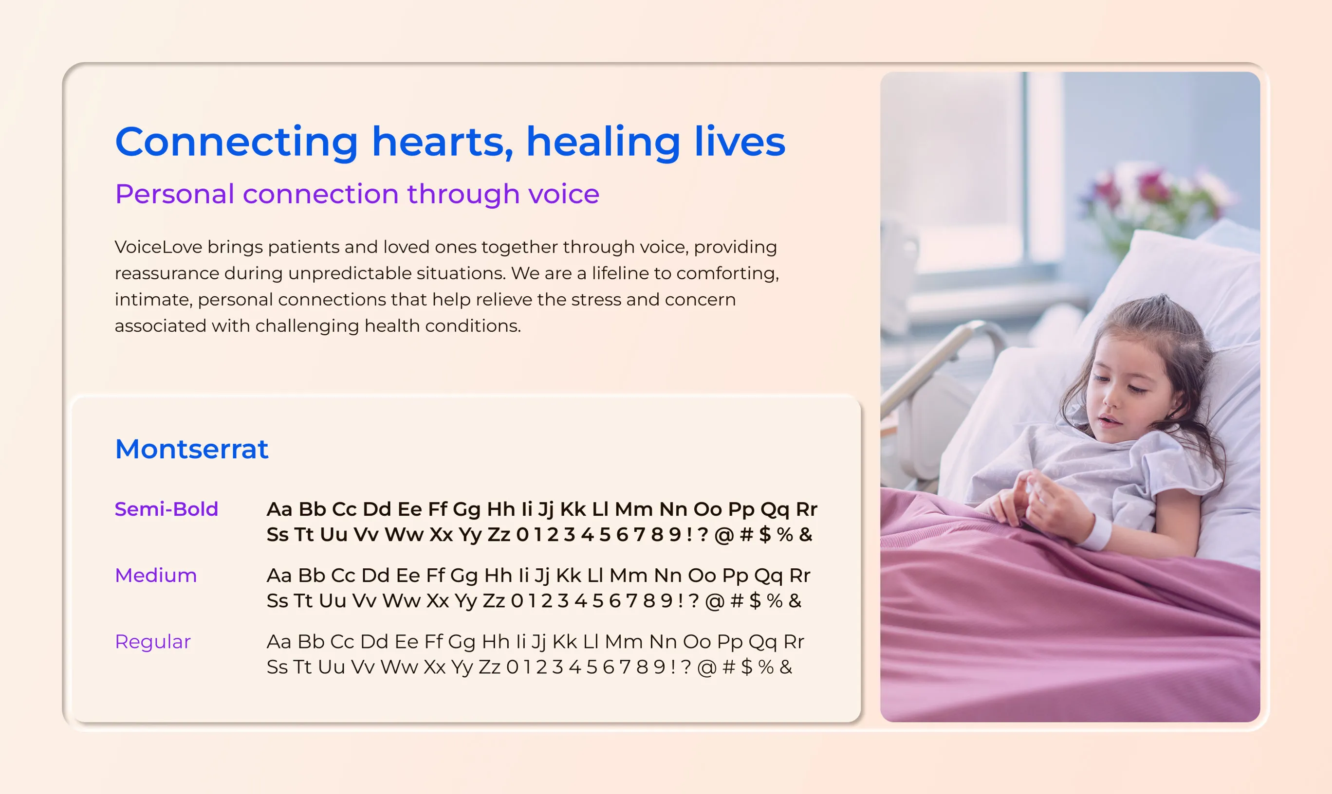
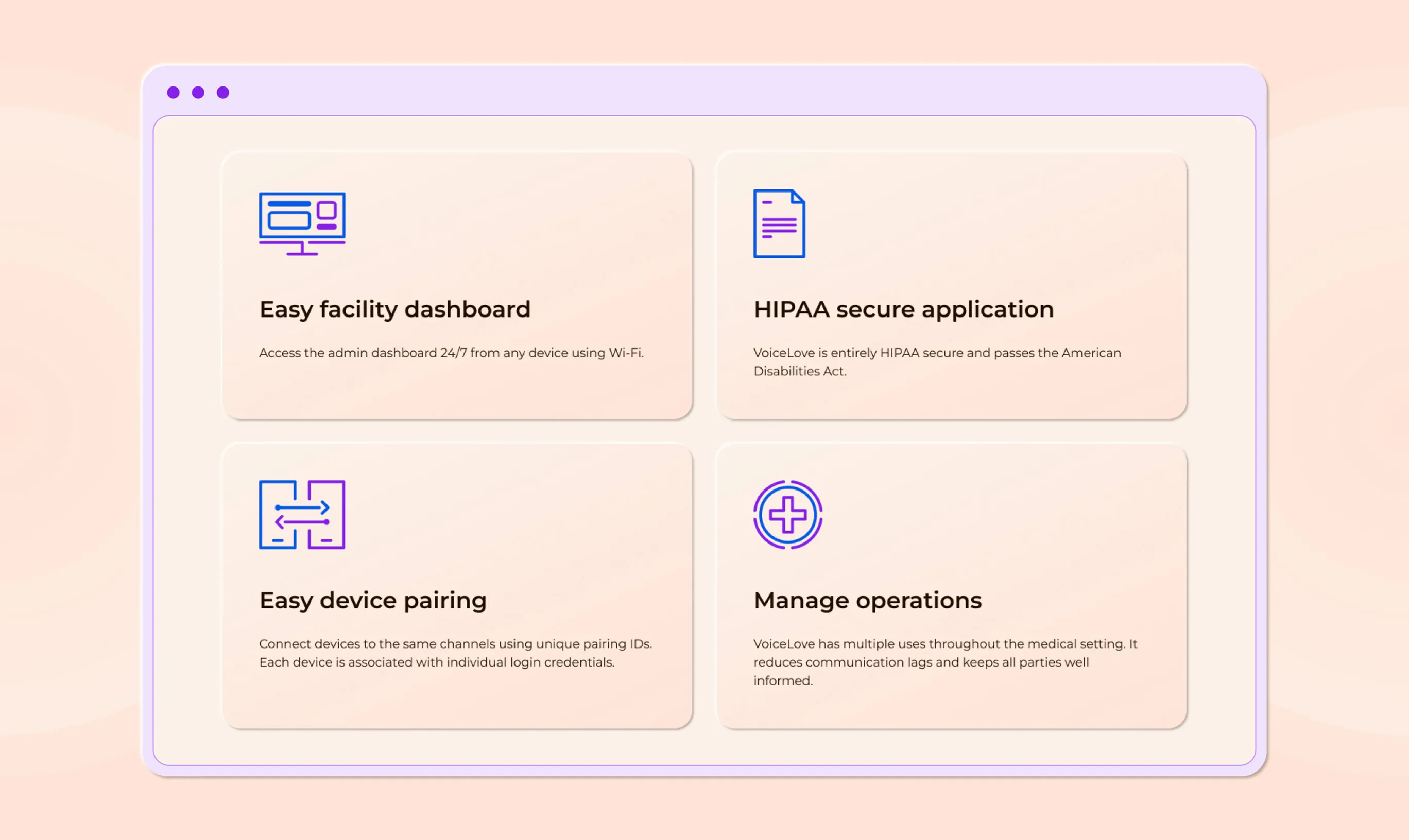
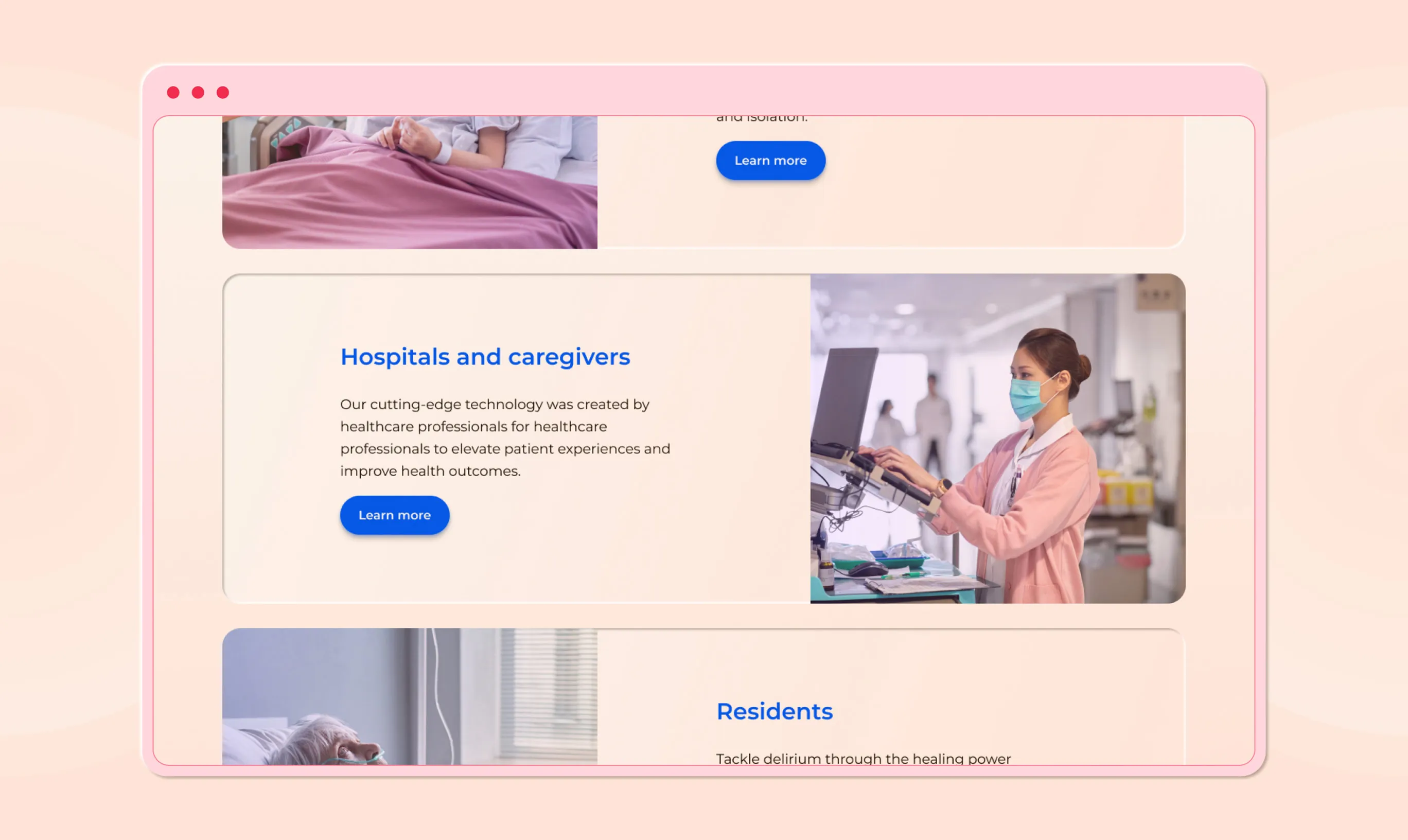
Typography became a medium to drive structure and reliability. I think that if a company is operating in a medical space, accessible, comfortable, and direct reading experiences can be a method of provoking connotations of trust. Additionally, the iconography, like the typography, is drawn to prioritize clear and direct communication while a user scans the website.
Colour lays an off-white landscape where a diverse range of colour can deliver bold focal points. The colour palette affords a combinations to visualize warmth, being inviting, and hygiene (without sterility).
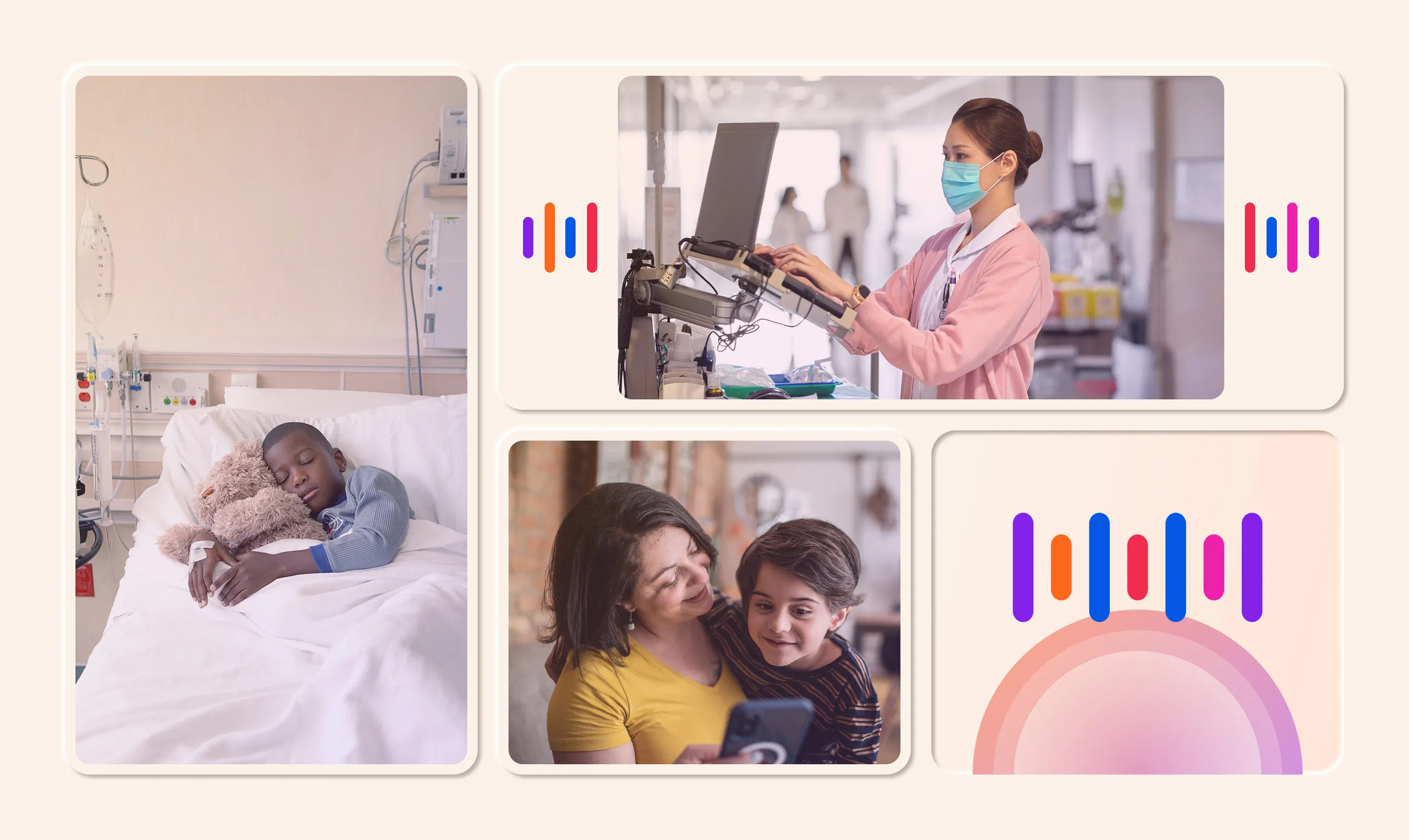
The image curation focuses on positive moods and mobile interactions both in and outside of healthcare facilities. Although VoiceLove operates primarily in acute care contexts, displaying persons as comfortable in facilities was prioritized over the realism of being hooked up to machines and tubes.
Next Project